As you think back on 2017, what will you remember most about this past year? Fake news? Hurricane Harvey? The Bitcoin bubble? Whether you’re reflecting on worldwide events or happenings that hit closer to home, it’s fascinating to consider how the increase of accessible, actionable data has impacted the world this year.
For data.world, 2017 was a year of exponential growth. Not just for us as a company, but also for our quickly-expanding community. In case you missed them, we’ve put together this list of 10 data.world team favorites that capture the diversity of thought and output from our community’s work this past year.
These data viz whizzes are making the world a more connected place, one Monday at a time. Members from the social data project Makeover Monday post a link to a chart and its data each week, and then the community reworks the chart. Whether it’s a simple bar chart or an elaborate infographic, they encourage everyone to partake.
Join the challenge at https://www.makeovermonday.co.uk/.
Source:
Jack HagleyZuar created this awesome tutorial to help folks level up their Tableau game. The data project includes a guide, tutorial, and exercises for learning the basics of business data analysis & visualization through an immersive use case.
Want to learn how to create a variety of views to explore data in Tableau? Get started here.
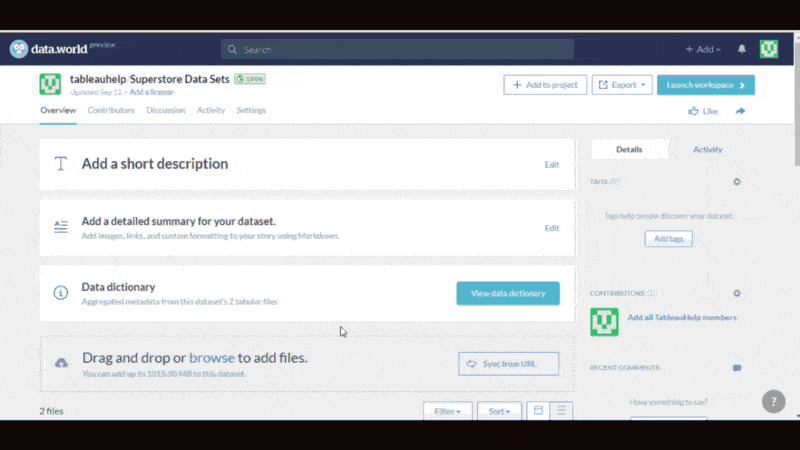 Tutorial by Zuar
What do Grenada, Guyana and Gambia have in common? They’re all on Global Footprint Network’s list of countries with the lowest ecological footprint.
Global Footprint Network’s National Footprint Accounts (NFAs) measure the ecological resource use and resource capacity of nations since 1961. The organization published the data behind their 2017 edition on data.world, leading to several analyses that help us better understand how economic growth (GDP) is correlated with the consumption of natural resources.
Make a difference in 2018 by joining Global Footprint Network in the fight to reduce our collective ecological footprint. Here’s a great first step: calculate your own ecological footprint here.

Data visualization by
Noah RippnerData for Democracy began as an experiment in December 2016, when people from around the world began to collaborate on data-related problems by using Slack for planning, GitHub for code, and data.world for data collaboration. With no rules or formal organizational structure, the focus was on getting real and impactful work done with minimal delay.
This dataset was one of the first projects launched by the organization, which has grown to include over 2000 e-volunteers across the globe. Using this dataset and the data.world R package, community member Jennifer Thompson was able to collect the data needed for one dashboard, create and publish a derived dataset, and build a Shiny dashboard that pulls live data from the site.
Read Jennifer’s story in R Views to see how she did it.
 App by Jennifer Thompson
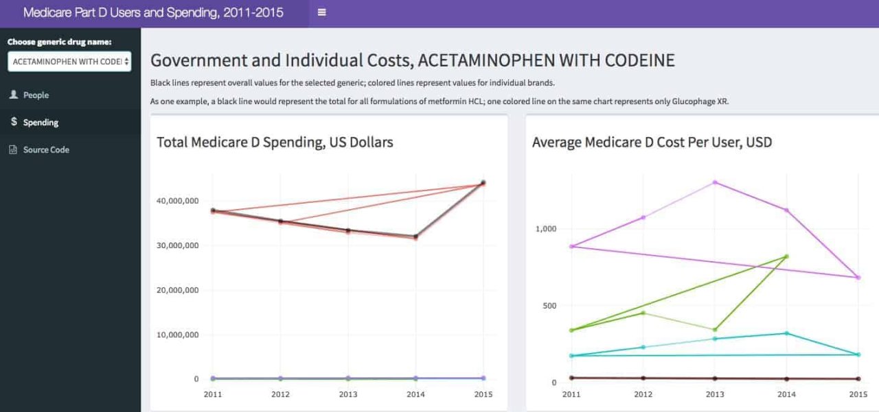
2017 saw a 365% increase in usage of the term “fake news,” according to Collins Dictionary. Despite growing cynicism and distrust of the media, this year we’ve seen a material shift in the field of journalism as data becomes the cornerstone for credibility among top news outlets around the world.
The data in this dataset was acquired from New Jersey’s Office of the State Medical Examiner after a months-long fight over the records, and within 24 hours of publication, incoming Governor Phil Murphy promised “wholesale reform” of the system in the coming legislative session.
We love this dataset because it’s an incredible example of how data-driven journalism can help inform communities and even impact public policy. Read more about NJ Advance Media’s 18-month investigation in Death & Dysfunction: How N.J. fails the dead, betrays the living, and is a national disgrace.
 Story by NJ Advance Media
39 counties made it onto the list of Hurricane Harvey Presidential Declared Disaster (PDD) Areas. While most areas that suffered property damage needed assistance for repair and rehab costs, areas with limited resources benefited more from careful targeting by the federal disaster recovery programs.
SP Group identified those neighborhoods that were most vulnerable to the negative impact of property damage and published the data on data.world. And they weren’t the only ones to do so; searching “Hurricane Harvey” on data.world returns dozens of datasets created by various community members and organizations, all seeking to aid hurricane recovery efforts by making important data more accessible to those who need it most.

Data visualization by
Alyssa SpinaAt data.world we believe the (near) future of data is linked, and we’re excited to see more community members unlocking the true potential of linked data and using SPARQL, a semantic query language for databases (and our owl mascot’s namesake). A query in this dataset recreates the famous “Six Degrees of Kevin Bacon” problem in SPARQL — for any two actors in the database, this query will find (if it exists) a path of exactly six connections, via other actors through the movies they acted in together.
Ready to play “Six Degrees of SPARQL?” Simply replace the actor names in lines 7 and 8 of this query with actors of your choosing, and hit “run query” (Warning: this may be too much fun to run only once).
 Six degrees of SPARQL query
Rising overdose rates in the United States due to opioid abuse is an alarming trend affecting families across the nation. Data newly available via USAspending.gov and posted on data.world by the Treasury Department includes detailed program descriptions and agency information, providing insight into the federal government’s efforts to address the issue.
@haotianxu91 dug into this dataset to find out whether federal data can be linked to opioid abuse treatment and prevention programs. Explore his findings here.
By making data publicly available and more accessible via data.world, many local, state and federal government agencies are taking strides toward better accountability and transparency with their spending. Find more government data on data.world by searching for agencies by their data.world organization name.

Insight by
Haotian XuIf you had the foresight to invest in Bitcoin this time last year, you’re probably sitting pretty. If not, you can use the Bitcoin Regret Calculator in this dataset to find out how much you could’ve profited.
This project is set to pull the latest daily coin data from Coin Metrics, a data aggregator and visualization service, using the data.world sync applet on IFTTT. View price trends for over a dozen cryptocurrencies, and various supporting visualizations in the dataset discussion.

Data visualization by
Patrick McGarryAnother example of outstanding data journalism work, this dataset met some of society’s largest social media issues head-on by digging into the data about external influence via Facebook during the 2016 US presidential elections. The investigation was subsequently picked up by a number of publications including The Washington Post and The New York Times.
The data presented here by Jonathan Albright of the Tow Center for Digital Journalism is a catalog of the non-promoted organic reach of the posts on each of five alleged foreign influence ops pages. Along with the complete text archive for each post, this data sheds light on the larger potential impact of the use of Facebook’s platform beyond a single advertising buy. Specifically, the work presented here suggests that there was much more widespread exposure of the content from these five closed pages. Further, the discussion on this dataset is some of the most engaging discourse we’ve seen this year on data.world.
Jonathan encourages you to use this dataset for your own research and analyses. This aggregate dataset is also a great resource showcasing other data journalism work on data.world.

Interactive visualization by
Jonathan AlbrightOur team can’t wait to see what the new year has in store for the data.world community. Stay in the loop on the best new datasets and projects of 2018 by subscribing to our weekly Data Digest email.
What if everyone at your company could learn from data, not just the data-savvy? Collective Data Empowerment makes it possible.