

When you create a free account, you don’t just gain access to a rich bank of open data and a powerful platform for analytics and insights: you become a member of the world’s largest collaborative open data community. Together, our community members uncover new insights, helping the world get answers and formulate response strategies.
With that mission in mind, we’ve collected the most up-to-date and trusted open data related to COVID-19. Scientists, analysts, researchers, entire businesses, and others all over the world are working together in data.world to track trends, find clues, and share insights. And now, so can you. Welcome to the largest, most diverse team seeking a global solution.
If you have questions, additions, or corrections, please contact patrick@data.world.

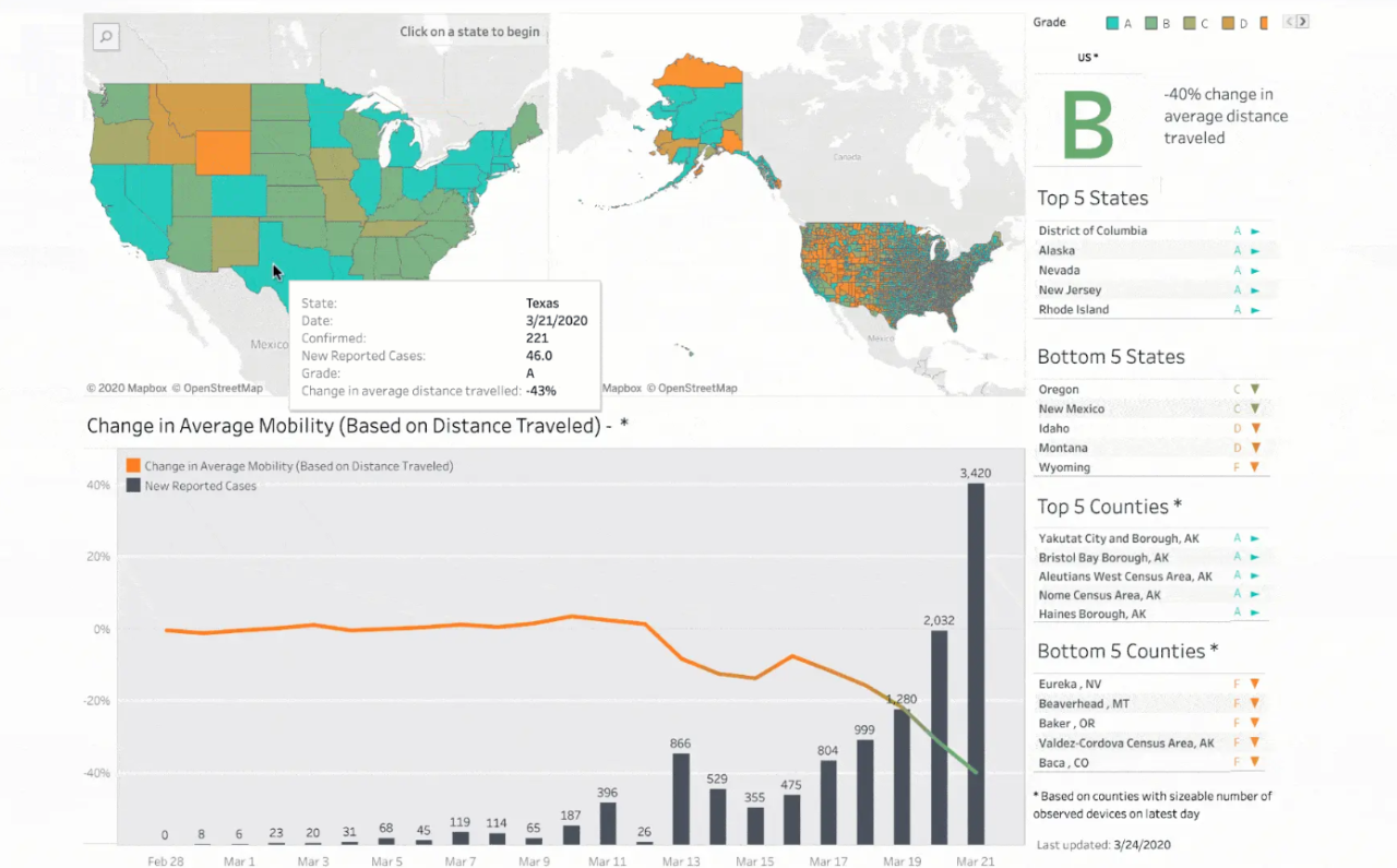
The Tableau team has cleaned, organized, and published the Johns Hopkins data on data.world to make it easier to visualize and analyze. For the most up-to-date summary of the data and to explore the latest visualizations from the Tableau Community see Tableau’s COVID-19 Data Hub and FAQ.
Tableau has also created a dataset that tracks policy responses to COVID-19 globally (at the country level) as well as within the US (state level) using their coronavirus data hub account. These datasets are sourced from the University of Oxford and University of Washington respectively, and cover policies on schools, businesses, public events, gatherings, transport, travel, stay-at-home requirements and more.
You can leverage data.world’s web data connector to allow you to easily pull data directly into Tableau to create visualizations.
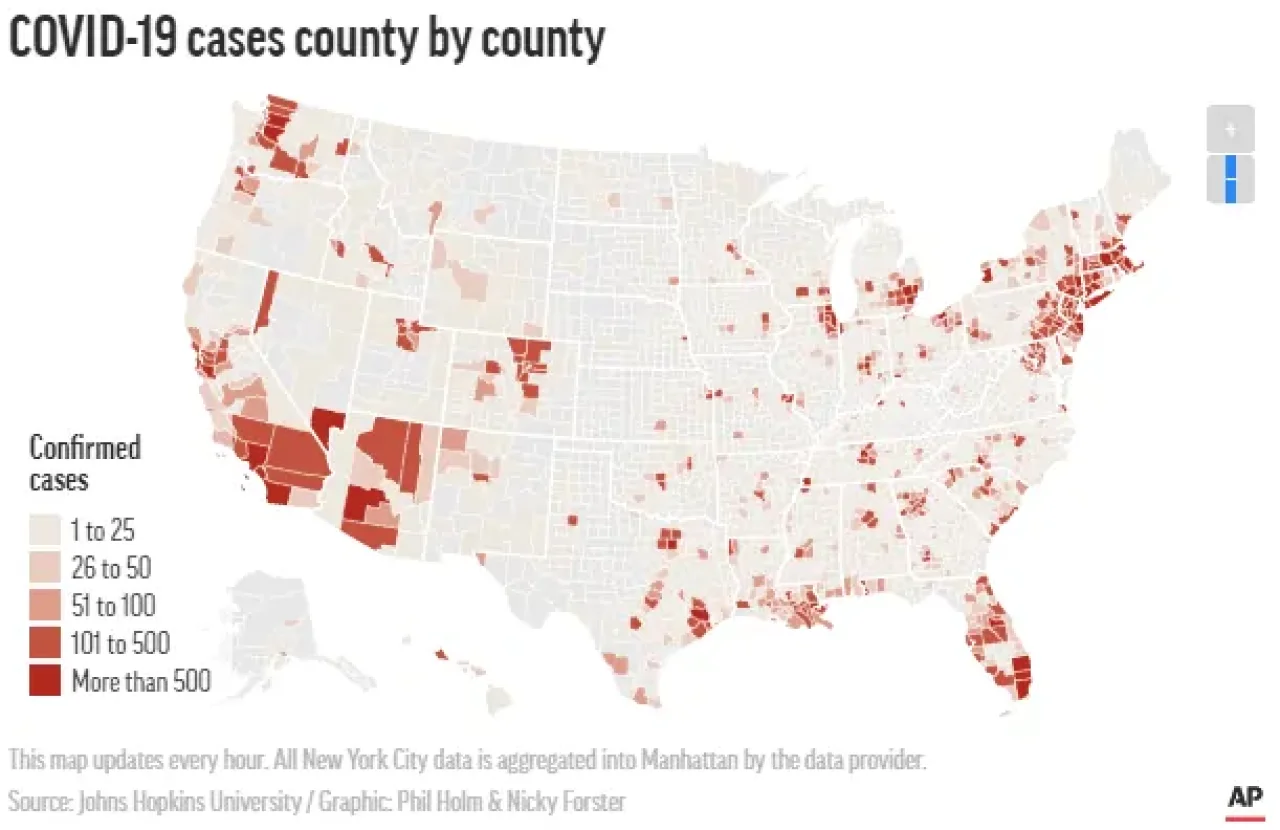
The Associated Press has made their version of the Johns Hopkins University COVID-19 tracking project data available to the public. This data is paired with population figures and county rural/urban designations, and has calculated caseload and death rates per 100,000 people. This dataset is updated hourly at 45 minutes past the hour.
The Associate Press, working with the Marshall Project, has also made COVID-19 data available as it relates to prison populations.
In addition to the data (and sample queries), The Associated Press has also included an embeddable interactive visualization (and the code to embed it) in their project summary. To learn more about AP’s data journalism capabilities for publishers, corporations and financial institutions email kromano@ap.org.
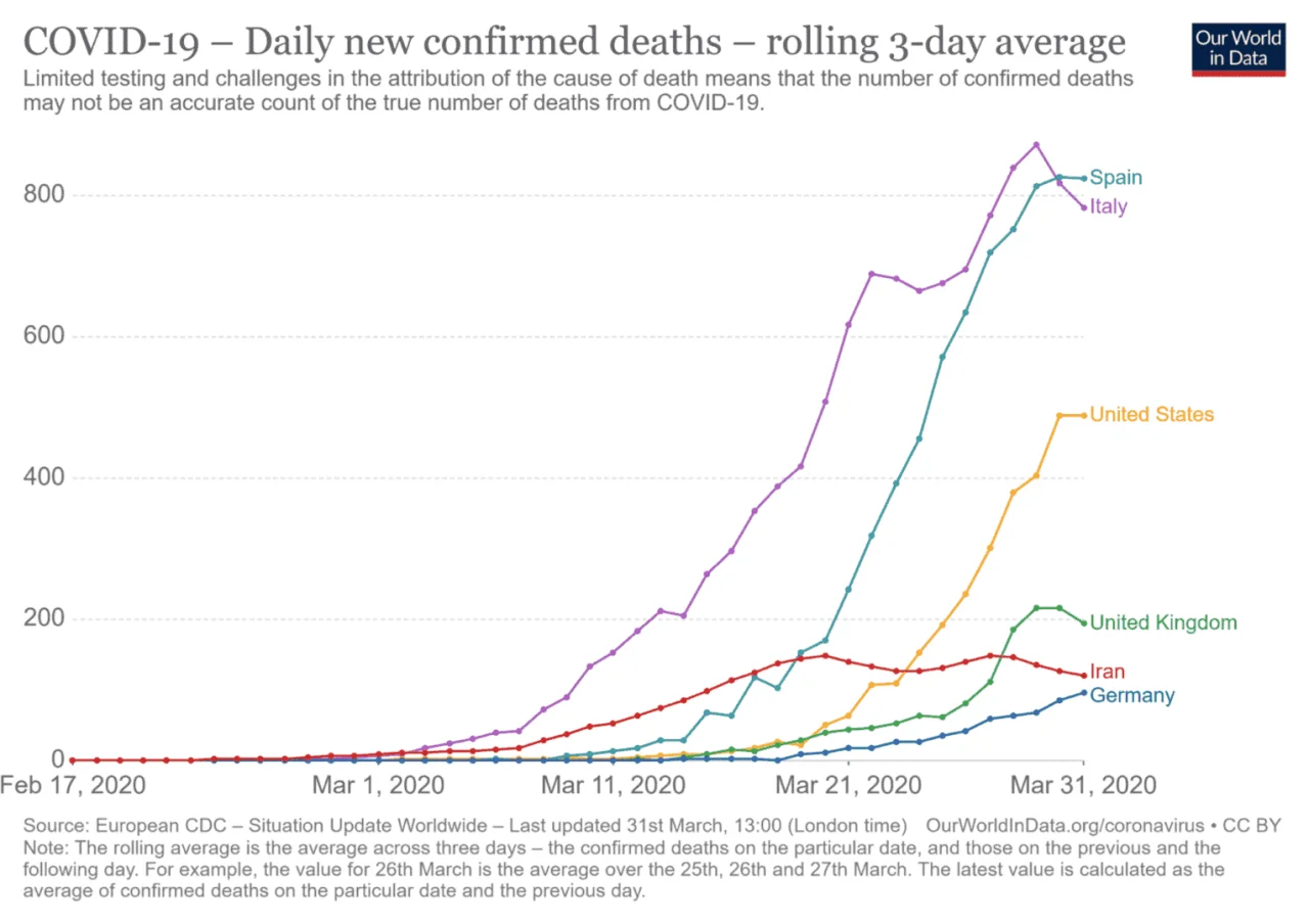
data.world is replicating the European CDC data as shared by Our World in Data (OWiD). For the most up-to-date summary and insights on this data please see the OWiD page dedicated to this work.
This dataset was originally sourced from the data put out by the World Health Organization (WHO). For a detailed writeup on why OWiD shifted their coverage to the ECDC data, you can read their coverage here. The data contained in this source focuses primarily on the number of deaths and cases, and more specifically, how quickly those numbers double. For a complete list of visualizations (over 40 in total) you can also view their insights page.
Wunderman Thompson has connected the health, demographic, and consumer transaction data from their Identity Network with current available Covid-19 data, and other market information, to create a county level view of population Risk, Readiness, and Economic Recovery*.
The Wunderman Thompson Identity Network is an individual (non-cookie based) Identity Graph that consists of thousands of insight elements connected to over 270,000,000 individuals in the U.S, integrated into a Watson machine learning platform, with an ability to activate targeted consumer communications seamlessly into digital media, marketing, CRM, call center, and all addressable channels.
*Click through for full RRI index detail.

The New York Times has been working on their own aggregation of time series data pulled from state and local governments and health departments. This data is for cases based in the United States and has both state- and county-level granularity starting with the first reported case in Washington State on Jan 21, 2020. For more information on their data collection methodology you can view the methodology and definitions section of the readme. If you decide to use this data in your research please send them an email to covid-data@nytimes.com and indicate if you would be willing to speak to a reporter. This data was replicated from their original source on GitHub. For their full reporting and embedded visualization you can view their landing page.

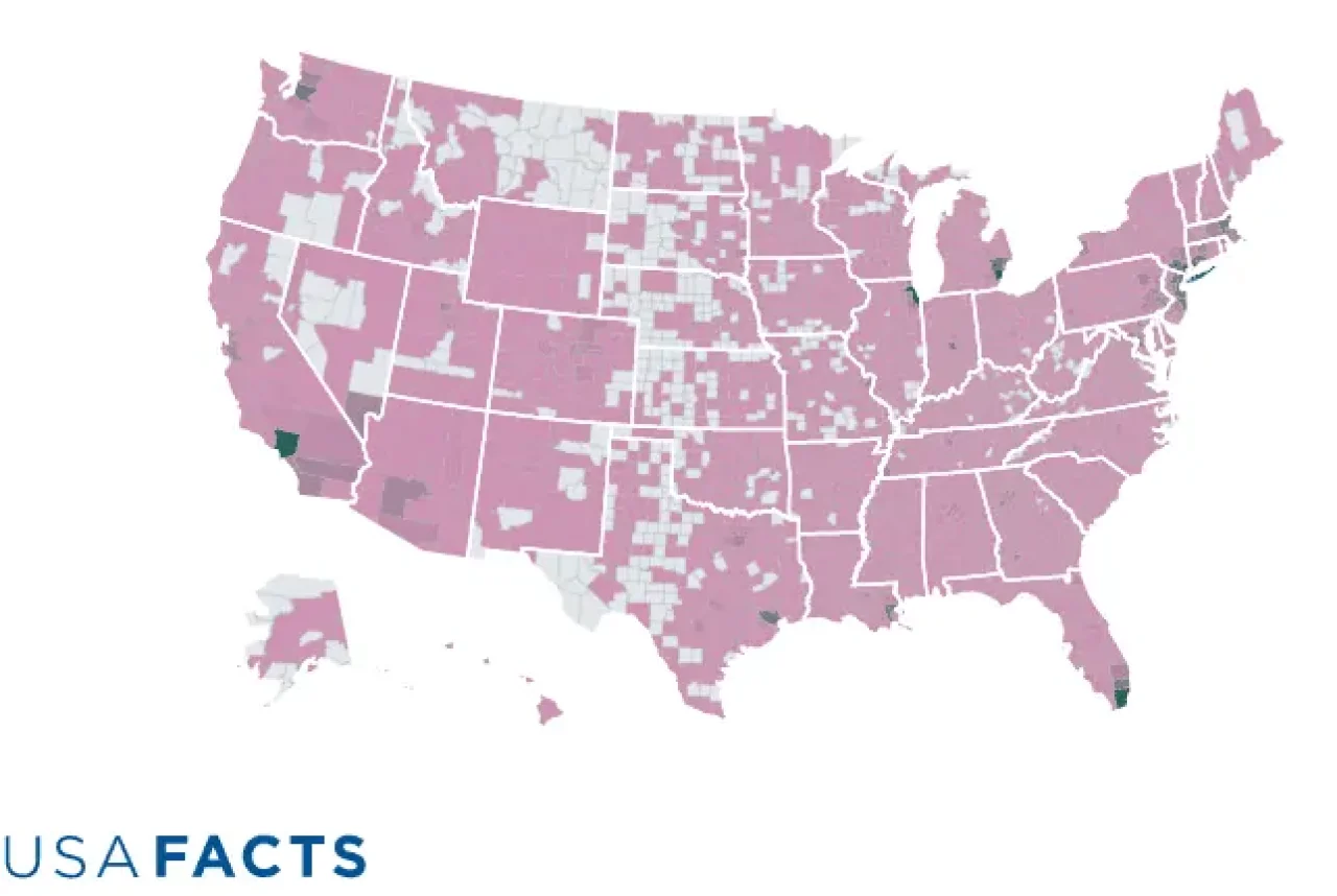
USAFacts is providing county-level COVID-19 confirmed cases and deaths compiled from government sources. Confirmed cases and deaths refer to COVID-19 instances that are verified and reported by state and/or local government agencies. They also offer a confirmed cases per 100,000 residents calculation using 2019 Census Bureau estimates. They believe this provides further context about the spread of COVID-19. Please note that population-adjusted calculations of confirmed cases are more sensitive to differences in testing availability. The datasets are updated throughout the day with a full refresh at the end of each day.
For more details, including visualizations that you can customize and embed, please visit the USAFacts Coronavirus Hub.
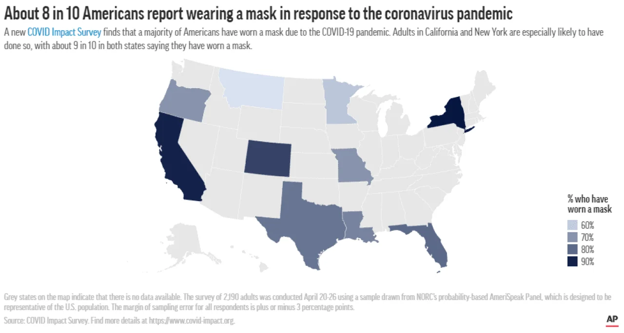
In cooperation with the Associated Press, NORC, MN Federal Reserve, and the Alfred P. Sloan and Packard foundations, the Data Foundation has commissioned an independent survey to cover physical health, mental health, and economic security in the United States.
The COVID Impact Survey aims to fill an information gap that currently exists in the United States, supported by philanthropy and government in the absence of a current analogous government survey. While the Data Foundation and other organizations are encouraging the federal government to launch similar, larger-scale efforts in coming months, data collection now is vital to our country’s future choices and we cannot wait for the government to act. Importantly, this information will be critical for policymakers in determining future actions for stay-at-home orders, social distancing policies, and other actions to combat the virus.
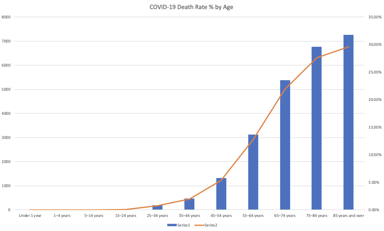
One of the most common questions and discussions when it comes to mortality and potential impact is usually around how it is effecting different age groups. data.world’s Brett Hurt, as a part of some of his strategic advising roles, decided to take a look at this specific data slice and share his results with the broader community. This data view is sourced from the US CDC data via their open API and is set to stay up to date on a daily basis. This project is actively soliciting feedback and participation.
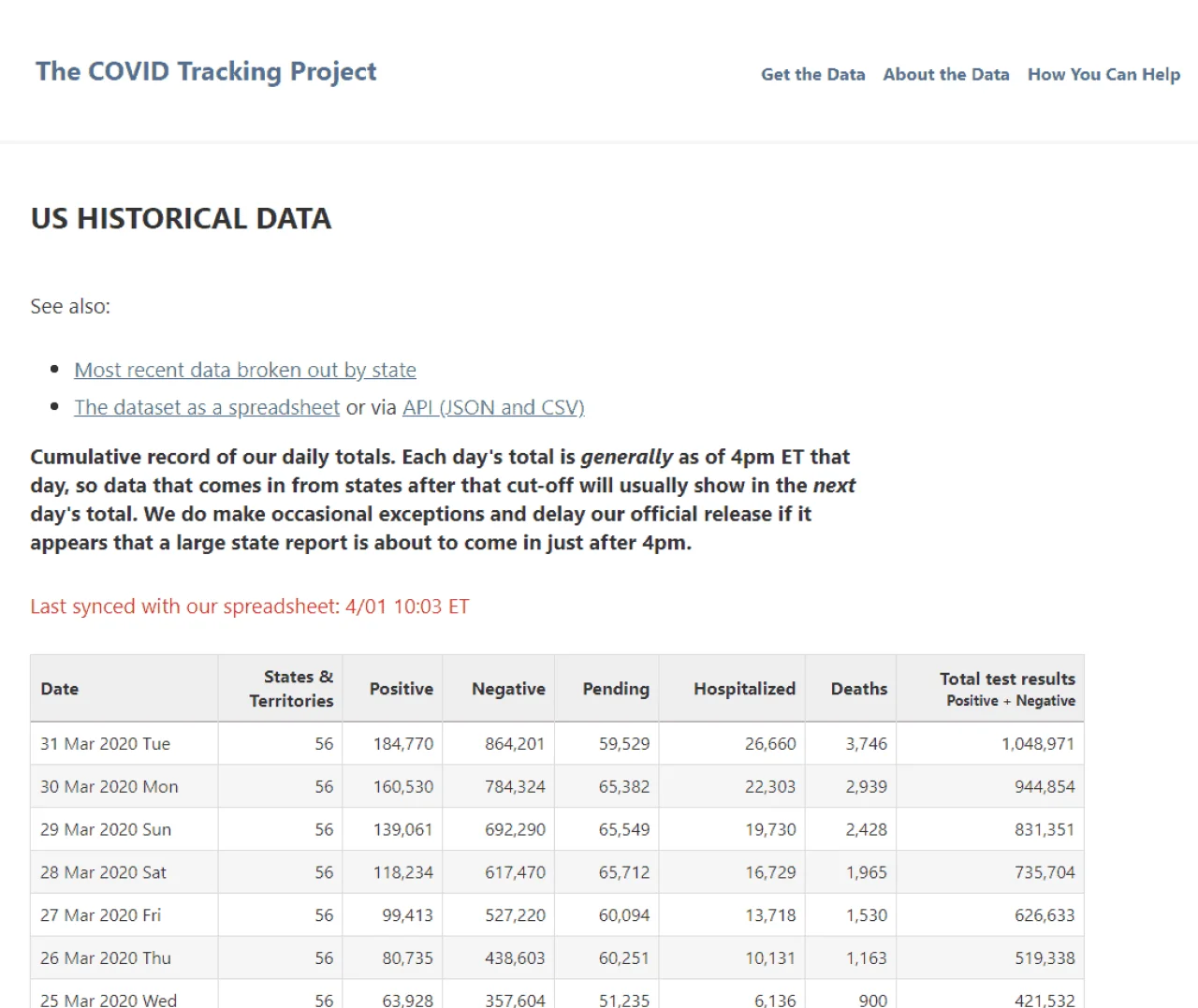
The COVID Tracking project is a United States-centric site that compiles information on the latest numbers on tests, confirmed cases, hospitalizations, and patient outcomes from every US state and territory, and more. Partnering with the Antiracist Research and Policy Center, they have also advocated for and published data on race and coronavirus. Thanks to their efforts you can now view race and ethnicity data from the 49 states or territories that report cases, and 48 that report deaths.
“Testing is a crucial part of any public health response, and sharing test data is essential to understanding this outbreak. The CDC is currently not publishing complete testing data, so we’re doing our best to collect it from each state and provide it to the public. The information is patchy and inconsistent, so we’re being transparent about what we find and how we handle it—the spreadsheet includes our live comments about changing data and how we’re working with incomplete information.”
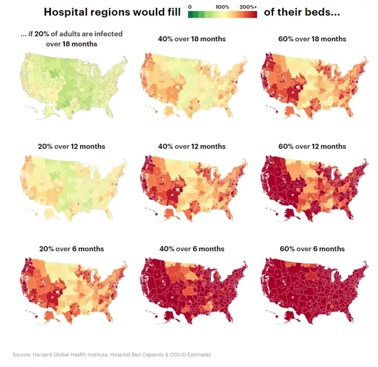
The Harvard Global Health Institute has a new model that builds on hospital bed capacity and type in each of 306 different U.S. hospital markets (Hospital Referral Regions or HRR) to now offer localized estimates of available beds and the beds that will be required in the coming months for the COVID-19 health crisis. HGHI worked with the Harvard T.H. Chan School of Public Health, ProPublica, and the New York Times to fact-check, interpret, contextualize, and visualize the data for policy makers and hospitals, and now data enthusiasts, companies, and individual practitioners can make use of it here on data.world.
Researchers and leaders from the Allen Institute for AI, along with leading research groups, released the COVID-19 Open Research Dataset (CORD-19), a free resource of over 29,000 scholarly articles, including over 13,000 with full text, about COVID-19 and the coronavirus family of viruses for use by the global research community.
On March 16, 2020, the White House issued a call to action to the tech community regarding the dataset, asking experts “to develop new text and data mining techniques that can help the science community answer high-priority scientific questions related to COVID-19.”
The EPA recently published a list of 351 COVID-19 combatting disinfectants—and the Centers for Disease Control and Prevention (CDC) recommends abiding by this list.
Smarter Sorting took that list and matched it up against its database of consumer chemical goods. It is currently the only available source that maps Environmental Protection Agency (EPA) Registration Numbers directly to Universal Product Codes (UPCs). By matching on EPA Registration Numbers, Smarter Sorting is creating a growing list of UPCs and Product Names to make it easier for consumers to find these disinfectants.
For more on the initiative, check out Smarter Sorting’s recent blog post on the topic.
There are a wealth of other datasets that have been created by the data.world community including a Twitter disinformation analysis by KUNGFU.AI, or localized data like the English Local Authority. Feel free to search for others if you don’t see what you’re looking for!
