

Dec 21, 2016
Gary Hoover

If there is an urban-rural divide in American politics, it is far more pronounced in post-election headlines and quotes from anonymous party insiders than it is on the ground — or in the data.
The Atlantic’s Ronald Brownstein pointed to “the Divide Between City and Country;” Charles M. Blow’s New York Times op-ed focused on “the vast and growing divide between America’s rural and urban populations and their politics and sensibilities;” Nick Carey’s Reuters post-mortem found that urban and rural voters are “worlds apart,” and led with a quote from a Wisconsin pig farmer.
Some of these reports were more nuanced than others; most contained grains of truth. However, my lifelong study of elections, geography, demographics, and data has led me to believe that these observers were not comprehending the big picture as told through the actual data.
If you read all those reports, concentrating on the headlines about the “stark urban-rural divide,” you might conclude that there are only two types of Americans: those who live in expensive high rises in New York and other urban centers; and those (such as Nick Carey’s pig farmer) who work in agriculture and live in sparsely-populated areas far from their nearest neighbors and further still from cities.
This idea is often accompanied by maps showing a vast, dominant, and presumably rural empire of red counties.
But is it true?
This take on the election — and on the American people — is weak at best, if not completely wrong-headed. Here’s the truth:
America is not fundamentally divided between rural and urban. We are overwhelmingly urban in the broadest sense.
Trump won in some of the suburbs even in heavily Democrat areas.
Even some of our largest and most vibrant cities were carried by Trump.
Smaller cities, small towns, and rural areas voted heavily for Trump.
This is a very different take on things than a “stark urban-rural divide.”
I reached these conclusions after assembling and analyzing this dataset, which includes 2016-to-2012 comparisons, population and population density data, and election results by county as of November 13. If you want to understand how urban and rural voters actually behaved, it’s all there in the data.
We are not a nation of farmers, and haven’t been for decades. There are only about 2.2 million farms in the US, and farmers represent just 2% of the US population. The vast majority of Americans are urban, and the percentage continues to increase. But this “urban” may not match the “urban” of the media narrative.
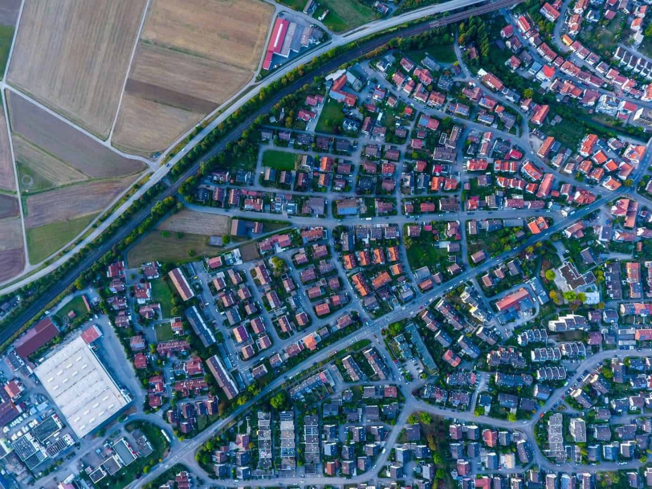
Geographers know that most urban residents live in single-family homes and multifamily apartments in suburban and “exurban” areas. These people are still urban: they work in urban centers and suburbs, their lives revolve around urban amenities including education, shopping, sports, and entertainment.
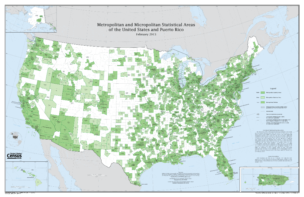
Many people are familiar with the Census Bureau’s definition of Metropolitan Statistical Areas (MSAs). The government also lists Micropolitan Statistical Areas, urbanized areas where the central city is smaller than the 50,000 population cutoff used for Metro Areas. (Note however that these areas all have populations greater than the central or core cities after which they are named — some Micropolitan Areas have total populations as high as 180,000). A map of the US showing these areas is a bit more telling than the simple county map above. Metropolitan Areas are shown in dark green, Micropolitan Areas in lighter green.
 Metropolitan and Micropolitan Statistical Areas map from the US Census
I analyzed Metropolitan Areas by size class, such as those from 3 to 5 million, 500,000 to 1 million, and so on. In aggregate, Clinton won every size class down through and including MSAs of over 1 million. Trump won every size class below 1 million. Indeed, these are smaller cities and even small towns, but those people work in offices and factories, often went to the same universities, read the same Internet sites, and generally shop at the same stores and websites as other “urbanites.”
There is no question that Trump did receive the relatively small rural vote. Trump clobbered Clinton in truly rural areas 66.6% to 28.6%, but these voters only represented 8.7% of his total vote. The map below, created with the great software Maptitude, demonstrates his big lead in so many American counties.
However, 28 million Trump voters, 46% of his total, live in MSAs of over 1 million population. The third tab of the workbook examines all MSAs, listed in size order. Trump won 2 of the 10 largest cities in the US: Dallas-Ft. Worth and Houston. Among those cities bigger than 1 million, he also won (in order of size) Phoenix, Tampa, St. Louis, Charlotte, San Antonio, Pittsburgh, Cincinnati, Kansas City, Indianapolis, Nashville, Jacksonville, Oklahoma City, Louisville, Birmingham, and Grand Rapids. These are not farmers, nor are they all unemployed rust belters. Several of those cities are booming economically. Trump even won 11 of the 25 counties in the New York Metropolitan Area.
Why have so many been so wrong? And how can we avoid such pitfalls? I believe there are two reasons many observers have failed to see the big picture:
First, many do not deeply understand what it means to be urban. For a clearer view of what cities really are, read Joel Kotkin’s excellent recent book, The Human City. The two best websites for understanding cities are The New Geography and Demographia. The best book which compares the great cities of the world is this one.
Second, the media — and we as the audience — love a good fight and hard lines in the sand. We are continually exposed to false dichotomies in a world that is more complex. In our multidimensional, multicultural world, humans and their attitudes fall along a broad spectrum. Often they are normally distributed (the “bell-shaped curve”) or even bimodal (“double-humped”), as the political spectrum likely is.
Remember that even those we trust are not infallible, and we should not delegate our brains to anyone. Humans, their environs, and their behaviors are wonderfully complex. The most convenient narratives, especially those we personally want to be true, should arouse our healthiest scrutiny. The data to inform this scrutiny is more abundant than ever.
Similarly, conclusions derived from data that has been intelligently integrated from more than one source (as with my elections dataset) can illuminate the things we might otherwise miss and bring us closer to the truth than conclusions derived from data in isolation.
Disclosure: Gary Hoover is a paid consultant to data.world.

If there is an urban-rural divide in American politics, it is far more pronounced in post-election headlines and quotes from anonymous party insiders than it is on the ground — or in the data.
The Atlantic’s Ronald Brownstein pointed to “the Divide Between City and Country;” Charles M. Blow’s New York Times op-ed focused on “the vast and growing divide between America’s rural and urban populations and their politics and sensibilities;” Nick Carey’s Reuters post-mortem found that urban and rural voters are “worlds apart,” and led with a quote from a Wisconsin pig farmer.
Some of these reports were more nuanced than others; most contained grains of truth. However, my lifelong study of elections, geography, demographics, and data has led me to believe that these observers were not comprehending the big picture as told through the actual data.
If you read all those reports, concentrating on the headlines about the “stark urban-rural divide,” you might conclude that there are only two types of Americans: those who live in expensive high rises in New York and other urban centers; and those (such as Nick Carey’s pig farmer) who work in agriculture and live in sparsely-populated areas far from their nearest neighbors and further still from cities.
This idea is often accompanied by maps showing a vast, dominant, and presumably rural empire of red counties.
But is it true?
This take on the election — and on the American people — is weak at best, if not completely wrong-headed. Here’s the truth:
America is not fundamentally divided between rural and urban. We are overwhelmingly urban in the broadest sense.
Trump won in some of the suburbs even in heavily Democrat areas.
Even some of our largest and most vibrant cities were carried by Trump.
Smaller cities, small towns, and rural areas voted heavily for Trump.
This is a very different take on things than a “stark urban-rural divide.”
I reached these conclusions after assembling and analyzing this dataset, which includes 2016-to-2012 comparisons, population and population density data, and election results by county as of November 13. If you want to understand how urban and rural voters actually behaved, it’s all there in the data.
We are not a nation of farmers, and haven’t been for decades. There are only about 2.2 million farms in the US, and farmers represent just 2% of the US population. The vast majority of Americans are urban, and the percentage continues to increase. But this “urban” may not match the “urban” of the media narrative.
Geographers know that most urban residents live in single-family homes and multifamily apartments in suburban and “exurban” areas. These people are still urban: they work in urban centers and suburbs, their lives revolve around urban amenities including education, shopping, sports, and entertainment.
Many people are familiar with the Census Bureau’s definition of Metropolitan Statistical Areas (MSAs). The government also lists Micropolitan Statistical Areas, urbanized areas where the central city is smaller than the 50,000 population cutoff used for Metro Areas. (Note however that these areas all have populations greater than the central or core cities after which they are named — some Micropolitan Areas have total populations as high as 180,000). A map of the US showing these areas is a bit more telling than the simple county map above. Metropolitan Areas are shown in dark green, Micropolitan Areas in lighter green.
 Metropolitan and Micropolitan Statistical Areas map from the US Census
I analyzed Metropolitan Areas by size class, such as those from 3 to 5 million, 500,000 to 1 million, and so on. In aggregate, Clinton won every size class down through and including MSAs of over 1 million. Trump won every size class below 1 million. Indeed, these are smaller cities and even small towns, but those people work in offices and factories, often went to the same universities, read the same Internet sites, and generally shop at the same stores and websites as other “urbanites.”
There is no question that Trump did receive the relatively small rural vote. Trump clobbered Clinton in truly rural areas 66.6% to 28.6%, but these voters only represented 8.7% of his total vote. The map below, created with the great software Maptitude, demonstrates his big lead in so many American counties.
However, 28 million Trump voters, 46% of his total, live in MSAs of over 1 million population. The third tab of the workbook examines all MSAs, listed in size order. Trump won 2 of the 10 largest cities in the US: Dallas-Ft. Worth and Houston. Among those cities bigger than 1 million, he also won (in order of size) Phoenix, Tampa, St. Louis, Charlotte, San Antonio, Pittsburgh, Cincinnati, Kansas City, Indianapolis, Nashville, Jacksonville, Oklahoma City, Louisville, Birmingham, and Grand Rapids. These are not farmers, nor are they all unemployed rust belters. Several of those cities are booming economically. Trump even won 11 of the 25 counties in the New York Metropolitan Area.
Why have so many been so wrong? And how can we avoid such pitfalls? I believe there are two reasons many observers have failed to see the big picture:
First, many do not deeply understand what it means to be urban. For a clearer view of what cities really are, read Joel Kotkin’s excellent recent book, The Human City. The two best websites for understanding cities are The New Geography and Demographia. The best book which compares the great cities of the world is this one.
Second, the media — and we as the audience — love a good fight and hard lines in the sand. We are continually exposed to false dichotomies in a world that is more complex. In our multidimensional, multicultural world, humans and their attitudes fall along a broad spectrum. Often they are normally distributed (the “bell-shaped curve”) or even bimodal (“double-humped”), as the political spectrum likely is.
Remember that even those we trust are not infallible, and we should not delegate our brains to anyone. Humans, their environs, and their behaviors are wonderfully complex. The most convenient narratives, especially those we personally want to be true, should arouse our healthiest scrutiny. The data to inform this scrutiny is more abundant than ever.
Similarly, conclusions derived from data that has been intelligently integrated from more than one source (as with my elections dataset) can illuminate the things we might otherwise miss and bring us closer to the truth than conclusions derived from data in isolation.
Disclosure: Gary Hoover is a paid consultant to data.world.
Get the best practices, insights, upcoming events & learn about data.world products.