Because the 2020 census is the first truly online US census, the response method has been a key part of its response rate data. We might use this data to ask questions like: Which households are responding via the internet and which are not? Has the internet response option made it easier for households to respond? Although the coronavirus pandemic has likely affected early response rates, looking at the internet response rate might provide a nationwide perspective on the digital divide (the gulf between people with and without internet access) in the United States.
To begin to answer a few of these questions, we created a data.world project. Projects are where users can work and collaborate on datasets by bringing in data for analysis and then generating and sharing insights. (You can read more about the difference between datasets and projects here.) In this example project, we connected two datasets and then explored the relationship between them with a visualization.
Developing a question and finding an initial dataset
Before we knew we wanted to connect two datasets, our first step was to do some research to develop a question and locate our first dataset. We found that the 2000 census had an unpublicized, small test of an online response option. However, the 2010 census had no online option. So in preparation for the 2020 census, the Census Bureau conducted a test in Rhode Island in 2018 and found that of the 52% of households who responded on their own (without a census taker visit), 60% did so on the internet.
Now, as the 2020 census responses roll in, the Census Bureau’s interactive map shows the percent of households that have responded via the internet along with the percent of households that have responded in total, through internet, mail, and phone.
By April 27—about a month and a half since the census mailings went out in mid-March—the percent of households who had responded to the 2020 census was at almost 54%. So at this point we were curious about what proportion of these households responded on the internet. Would the national trend match that 60% in Rhode Island? What would the breakdown between states look like?
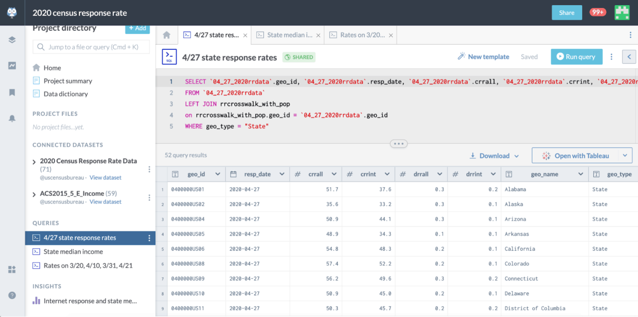
In order to answer this question and compare responses to the 2018 test, we needed to look at the percent of internet responses among respondent households (rather than out of all households, respondent or not). To do this we turned to the US Census Bureau’s dataset on data.world. We created a new project and connected it to this dataset. Then we created a SQL query to get the latest response rates at a state level.
Exploring data and using integrations
We decided to explore the results from our query in Tableau. You can pull data directly from data.world into Tableau by enabling Tableau integration and using the web data connector (and you can read more about this here).
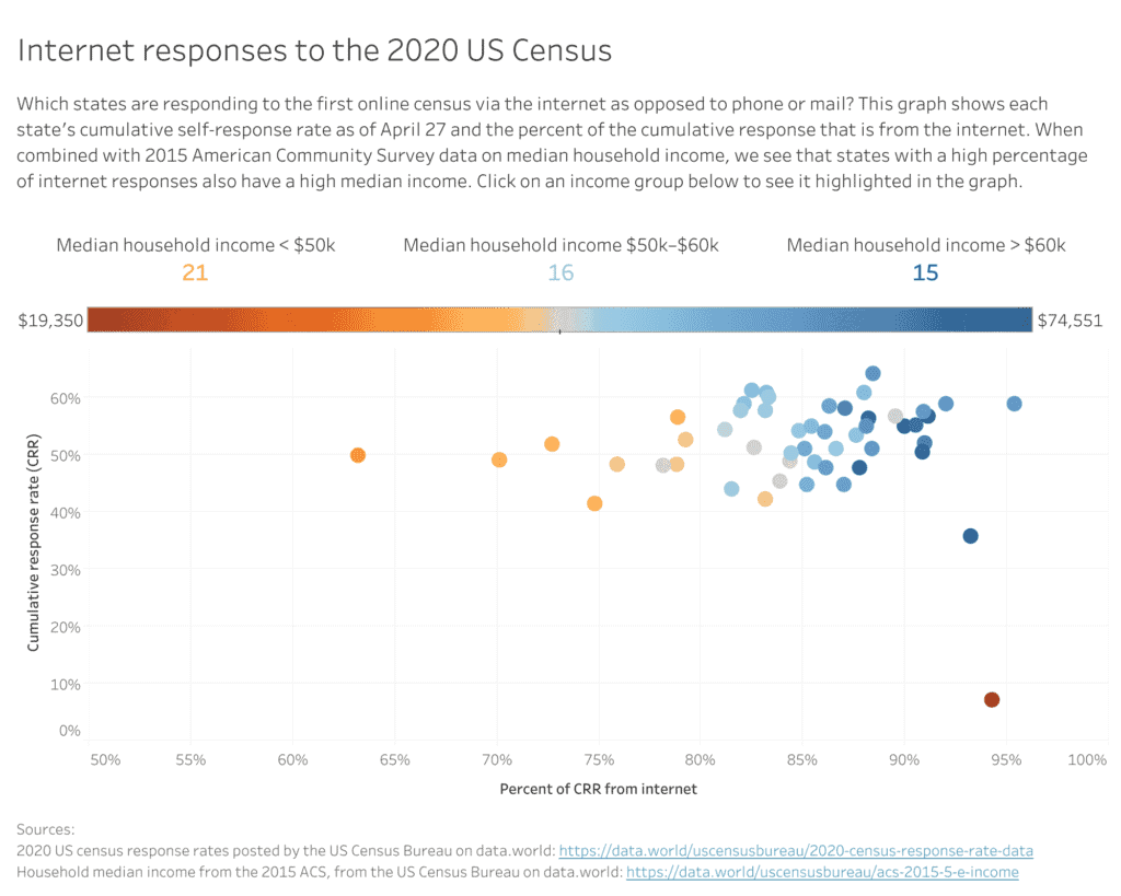
Once we had the data in Tableau we created a scatterplot based on the cumulative response rate and the percent of the cumulative response from the internet. This graph showed that the percent of these responses that are from the internet has far exceeded the 2018 Rhode Island test. By April 27, out of the 54% of households who responded, 85% did so on the internet. But we also found that this percent of internet responses varies widely from state to state, from 63% (Mississippi) all the way to 95% (Utah).
To start exploring this range, we connected our project to another dataset on data.world: one focusing on income from the 2015 American Community Survey. The digital divide and its relationship to income has been well researched, so state median income data from the ACS seemed like it might provide a helpful lens for analysis.
After connecting this dataset to our project, we wrote a SQL query to pull state median income, added the results to our Tableau file, and added state median income to the visualization as a color range.
Click to go to the live visualization.
While there are some outliers, the overall trend is clear: states with higher median incomes also have higher percentages of internet responses. Overall response rates are stable though, ranging from around 40–60% pretty evenly across states with different percentages of internet responses.
What’s next?
After creating a project, outlining your analysis in a summary, and sharing your insights, the next step is collaboration. Your insights can be built upon by others to inform their own analysis, or they could spark entirely new questions.
One question this project might lead to is how much of an impact the online option will have. Will it actually make it easier for households, particularly low-income households, to respond to the census? It might be interesting to see comparisons of 2020 response rates by household income with previous censuses.
Join the discussion!
What other questions might you have? Are there other datasets you might want to connect to? We invite you to create your own project that builds from the insights in this project to answer a related question or explore the question from a different angle. Or, if you want to practice the mechanics of using projects, try recreating this project yourself. Let us know how it goes in the discussion section!