

Jan 11, 2018
data.world Team

So you’re working on your first data project on data.world. (Don’t know about data projects yet? Check out part 1 and part 2.) Often, one of the hardest parts of a data analyst’s job is capturing the output of work and analysis and presenting that in a way that makes sense to stakeholders of all levels. That’s where insights come in.
Insights allow you to capture the conclusions from your work, packaging them up in a way that quickly communicates a nugget of information, while giving the viewer the tools then need to dig down into your methods and sources. Insights balance efficiency of communication with reproducibility, two concepts that are often at odds in this phase of data work.
So how do they work?
Insights can be generated from any file or query using the workspace chart tool. The examples below are all generated with this public dataset, which explores historical data around the Vietnam War. You’re encouraged to go explore and try out everything outlined in this post.
Let’s say I want to understand a geographical distribution of events. (For this particular data project, I’ll be looking at bombing runs by country.) To make my research accessible and meaningful to a wide audience, I’ll need a way to package up my findings in an easy-to-consume format.
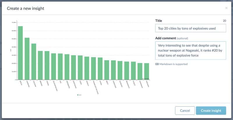
First, I ran a SQL query, then created a chart showing the distribution of events by location. I added a title and comment to help explain my findings. That added context only takes me a couple moments, but has big impact: it ensures everyone will understand my conclusions right off the bat without having to spend too much time analyzing (or misunderstanding) the chart themselves.
I saved this as an insight on the data project. Once a project contains an insight, it’ll show up front and center on its summary page, right alongside any other insights that’ve already been added.
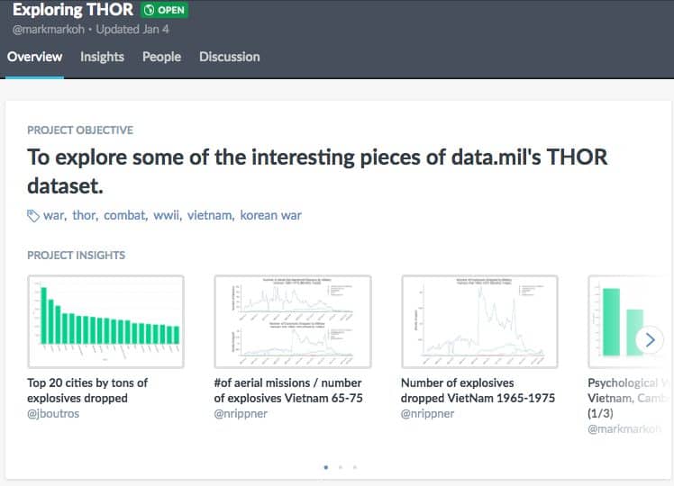 Try it: click here to view the data project summary and insights gallery
Anyone with access to the data project can scroll through the insights to get a high level idea of the project’s conclusions. Clicking through will display the full insight, with the description presented in a way to encourage discussion between team members.
Team members can ask questions, suggest other interpretations, tag in team members to view the insight, and even simply show appreciation for your work right on the insight itself.
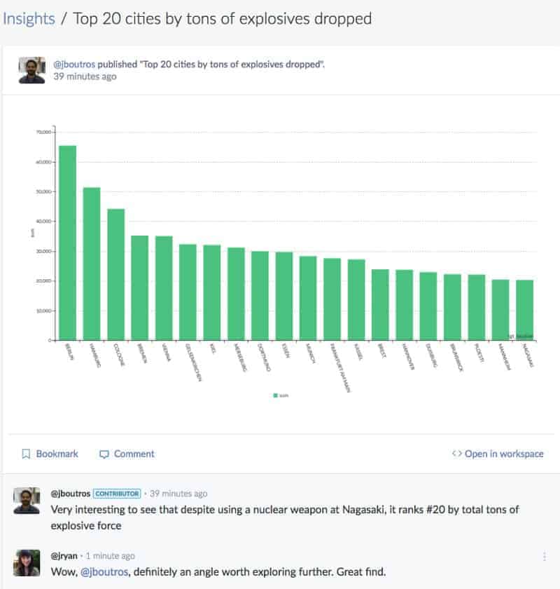 Try it: view this insight and leave a comment. Then, click “<> Open in workspace” to see the query behind it.
For those that want to dive in and see exactly how you derived your insights, the “Open in workspace” link will launch the workspace query tool and automatically run the query that generated this chart. That way they don’t have to just take your word for it, and you spend less time emailing messy spreadsheets.
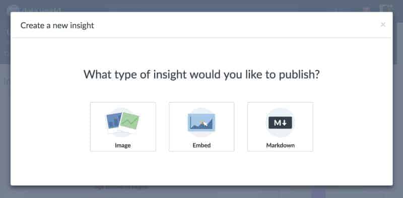
Suppose you’ve used our growing suite of integrations to visualize this data in another tool, such as Tableau or R Studio. You’re in luck! data.world works best when you connect your other data tools. Insights can also be created by embedding an interactive visualization from Tableau or uploading an image of an R plot. We’re hard at work on some deeper integrations for insights, too. Watch this space for more about that.
Now that you’ve captured these nuggets of information, it’s time to weave them into a story. Insights are embeddable in your project’s summary and can be connected together in a way that describes the big picture. For more great examples of this, take a deeper look at the data project used in today’s post: https://data.world/markmarkoh/exploring-thor
Got another great example of insights in action on data.world? Share it in a comment below!

So you’re working on your first data project on data.world. (Don’t know about data projects yet? Check out part 1 and part 2.) Often, one of the hardest parts of a data analyst’s job is capturing the output of work and analysis and presenting that in a way that makes sense to stakeholders of all levels. That’s where insights come in.
Insights allow you to capture the conclusions from your work, packaging them up in a way that quickly communicates a nugget of information, while giving the viewer the tools then need to dig down into your methods and sources. Insights balance efficiency of communication with reproducibility, two concepts that are often at odds in this phase of data work.
So how do they work?
Insights can be generated from any file or query using the workspace chart tool. The examples below are all generated with this public dataset, which explores historical data around the Vietnam War. You’re encouraged to go explore and try out everything outlined in this post.
Let’s say I want to understand a geographical distribution of events. (For this particular data project, I’ll be looking at bombing runs by country.) To make my research accessible and meaningful to a wide audience, I’ll need a way to package up my findings in an easy-to-consume format.
First, I ran a SQL query, then created a chart showing the distribution of events by location. I added a title and comment to help explain my findings. That added context only takes me a couple moments, but has big impact: it ensures everyone will understand my conclusions right off the bat without having to spend too much time analyzing (or misunderstanding) the chart themselves.

I saved this as an insight on the data project. Once a project contains an insight, it’ll show up front and center on its summary page, right alongside any other insights that’ve already been added.
 Try it: click here to view the data project summary and insights gallery
Anyone with access to the data project can scroll through the insights to get a high level idea of the project’s conclusions. Clicking through will display the full insight, with the description presented in a way to encourage discussion between team members.
Team members can ask questions, suggest other interpretations, tag in team members to view the insight, and even simply show appreciation for your work right on the insight itself.
 Try it: view this insight and leave a comment. Then, click “<> Open in workspace” to see the query behind it.
For those that want to dive in and see exactly how you derived your insights, the “Open in workspace” link will launch the workspace query tool and automatically run the query that generated this chart. That way they don’t have to just take your word for it, and you spend less time emailing messy spreadsheets.
Suppose you’ve used our growing suite of integrations to visualize this data in another tool, such as Tableau or R Studio. You’re in luck! data.world works best when you connect your other data tools. Insights can also be created by embedding an interactive visualization from Tableau or uploading an image of an R plot. We’re hard at work on some deeper integrations for insights, too. Watch this space for more about that.

Now that you’ve captured these nuggets of information, it’s time to weave them into a story. Insights are embeddable in your project’s summary and can be connected together in a way that describes the big picture. For more great examples of this, take a deeper look at the data project used in today’s post: https://data.world/markmarkoh/exploring-thor
Got another great example of insights in action on data.world? Share it in a comment below!