

Apr 13, 2017
Sharon Brener

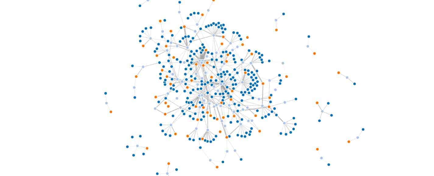 Our final visualization. Read on to see how we made it!
Those are the charges filed against Willie Cochran, a Chicago alderman accused of stealing “at least $30,000 from a charitable fund for poor constituents.” Cochran is the latest in a long line of Chicago officials indicted for corruption charges—over 1,000 since 1973.
Pretty stiff competition to get into the Chicago Hall of Shame.
So, how does an interested citizen stay informed about their local representatives? It seems impossible to keep track of legitimate political contributions, let alone the shady ones.
But, what if you could trace the money, based on publicly available data?
For the uninitiated, Data for Democracy is a group of 1,300 self-organized volunteers who work with data in order to improve the global community. D4D uses data.world, the social network for data people, to discover and explore data while collaborating on data projects.
Last weekend, hundreds of volunteers met up in major cities across the country (and remotely) to participate in the first D4D hackathon. We worked on dozens of civic projects, leveled up our data skills, and ate our weight in pizza (or, at least we did in Chicago).
“We could link alder-people by caucus or other ties, see their connections on the graph through politics and through lobbyist connections…maybe something in Shiny app form that people can play with… a network igraph would be pretty rad,” she mused on the #city-chicago Slack channel.
We considered the possibilities – what if we could link individual contributions to an alderman’s voting records? Could we track which special interests were influencing votes, understand what, when, and how much lobbyists were paying caucuses, and find a way to to put it all out in the open? That would be pretty rad.
So, we set out to answer this question:
We started with the City of Chicago’s open data portal. A quick search yielded a number of relevant datasets, including a list of all registered lobbyists since 2012 and their political contributions. It (almost) sounded like the work was already done!
But, as we explored the data, it wasn’t all sunshine and rainbows. Client industries were classified haphazardly, column definitions weren’t always clear, and tracing lobbyists to legislators would require joining multiple files. That meant we’d have to download each dataset (breaking the provenance chain), and create new files from them. We wouldn’t be able to share our findings or process alongside the data, making it more difficult for others to benefit from our analysis.
That’s where data.world came in. While preparing for the hackathon, we imported key datasets from the City of Chicago portal and other sources. We gathered data about Chicago lobbyists as well as a master dataset with links for each of the Chicago hackathon projects. This gave participants a single destination for all the relevant sources:
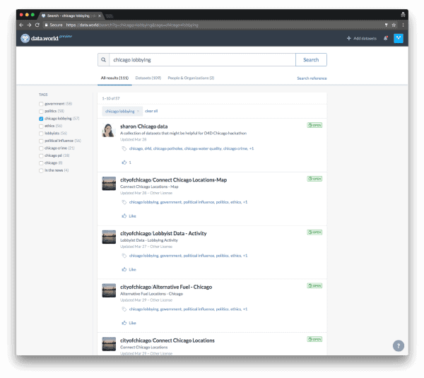
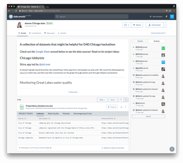 A one-stop-shop for Chicago data on data.world
On Friday night, we all met in person for the first time. After weeks of chatting over Slack about potential data projects, scrutinizing our hackathon playlist, and debating who makes the best pizza in Chicago, we were finally ready to hack all the things!
Each lead pitched their idea to the group, and our 35 local participants broke out into three projects:
Chicago EPA started investigating Chicago’s water quality in light of funding cuts to programs that clean up the Great Lakes.
Bolsa Familia got to work analyzing the Brazilian social welfare program and its relationship to the 2014 election of Dilma Rousseff.
And of course, our project, Chicago lobbying, set out to connect the dots between special interests, lobbyists, and Chicago aldermen.
Once we split into groups, Team ChiLo got down to business. We white-boarded out the problem and broke it down into tasks. We dug into the data on data.world and researched visualizations similar to what we envisioned for our end result.
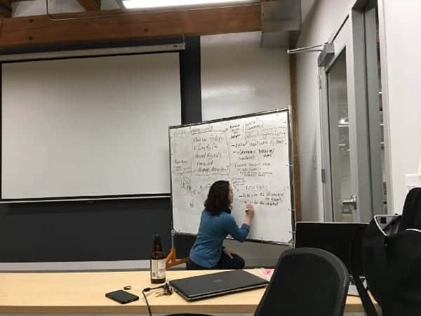
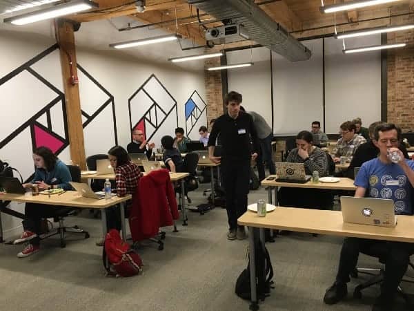 Team ChiLo in action at the Metis Data Science Bootcamp space!
With only 10 hours together in person, our task list felt daunting. For the weekend, we decided to limit our scope to Chicago’s 50 aldermen instead of all elected officials.
We got to work cleaning and joining datasets in the data.world query tool (with the help of this handy tutorial), classifying the funding sources by industry, and joining alderman voting records with legislation details. We wrangled the data with a lot of R, some Python, and even good old-fashioned Excel. People of all skill levels contributed, using their tool of choice.
Of course, there were ups and downs. Early on, we were excited to find unique IDs for lobbyists…that turned out to not be unique…that after more investigation turned out to actually be unique. (Maybe? Jury’s still out.) We had to make a last-minute decision to constrain the time period to fewer years than we had hoped to analyze. But we persevered, and by half-way through the first night, we had enough data cleaned and transformed to spin off a dedicated Chicago lobbyists dataset:
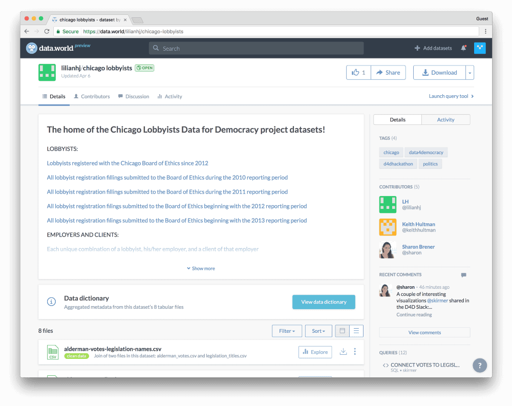 Check out the Chicago lobbyists dataset →
We added file descriptions and column definitions so others could understand the variables:
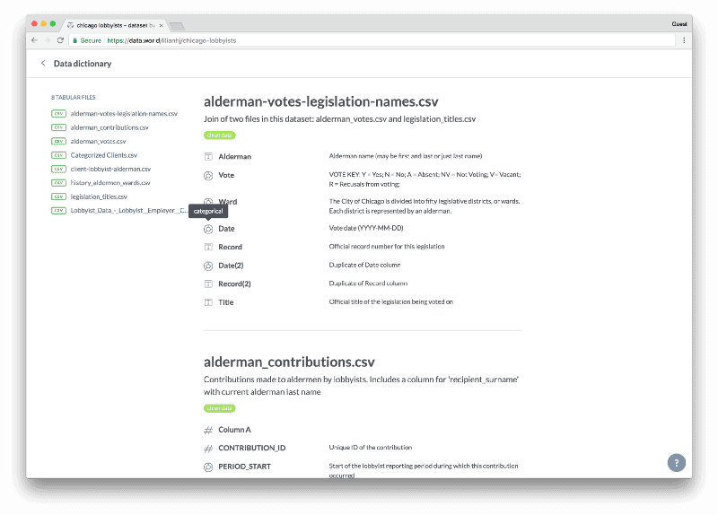 data.world automatically aggregated descriptions from every file in the dataset, along with each column type.
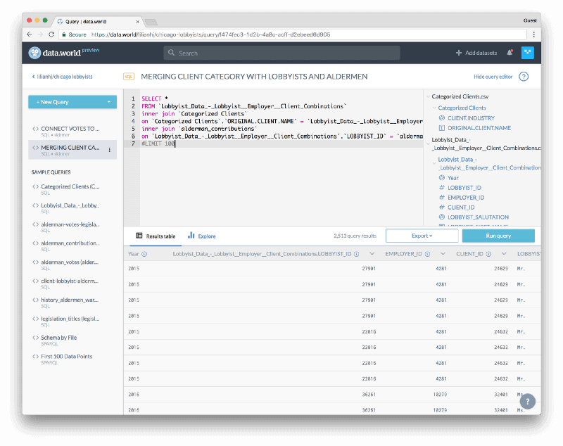
Using the built-in query editor, we joined three files to combine data about aldermen, lobbyists, and clients into a single table:
 Dig into this query for yourself →
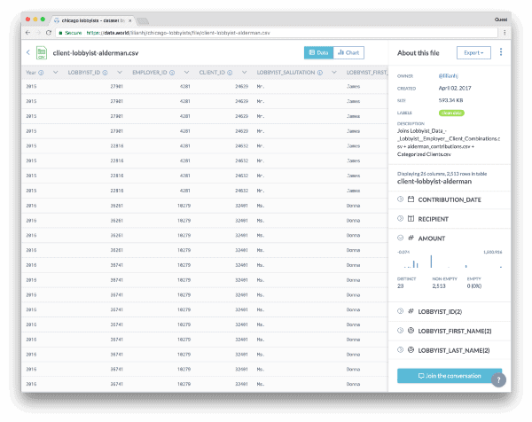
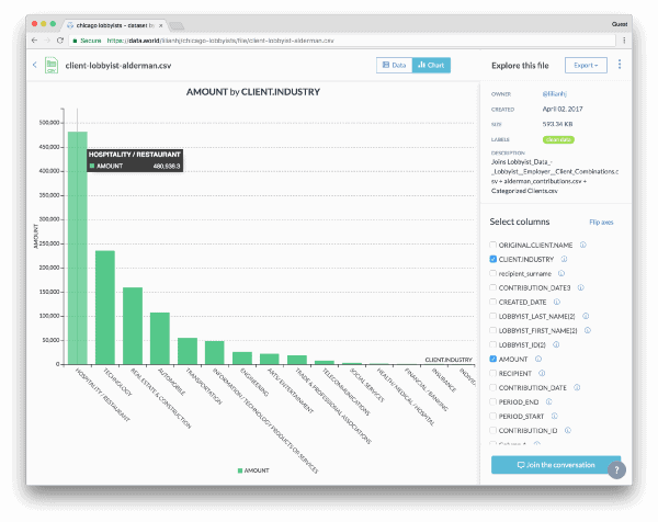
We exported that query and added it to the dataset as a new CSV. Opening the file full-screen, we got a good look at the data alongside the column metadata and visualized the data by selecting different columns to chart. Apparently, the most contributions come from the hospitality industry — over twice the amount of the next-highest sector (technology). Who knew!
 Explore this file →
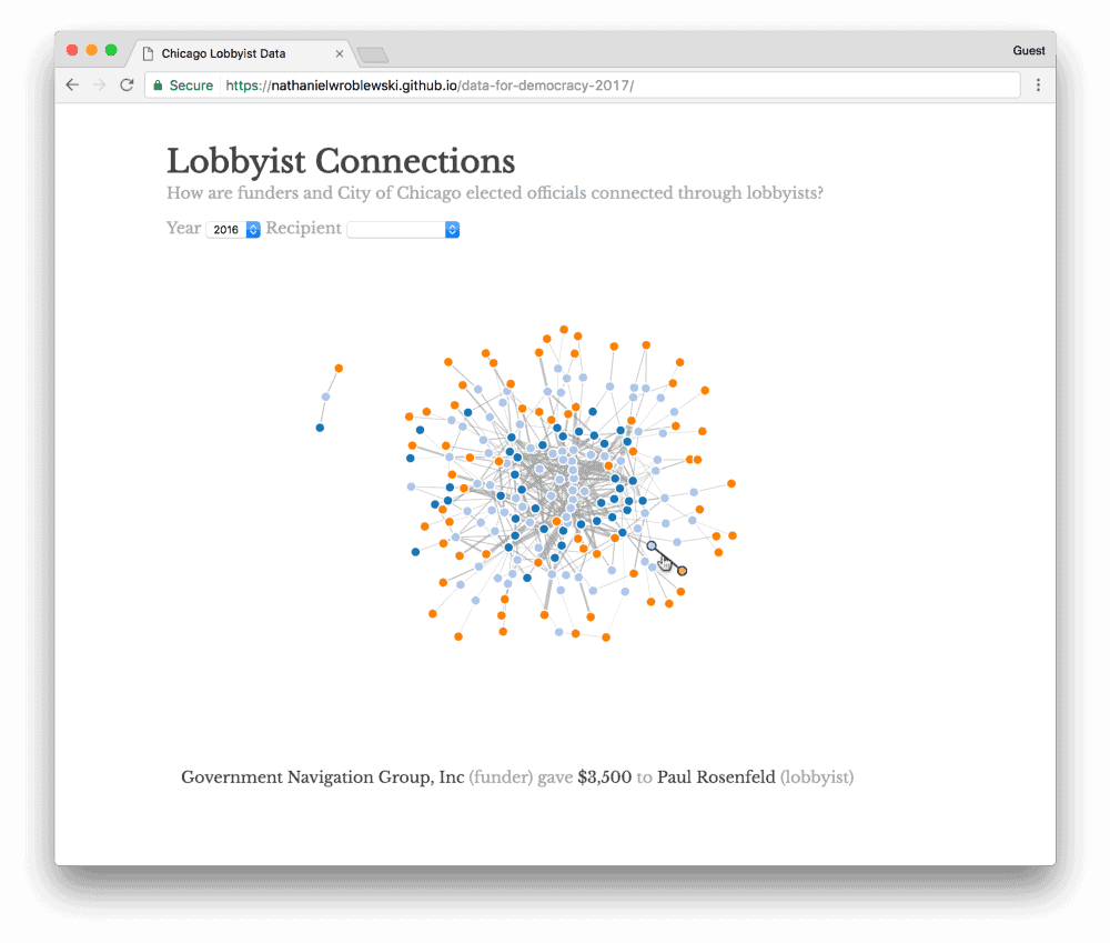
By the next morning, we were ready to start on our showcase visualization. We settled on a network graph with a node for each funding source (orange), lobbyist (light blue), and alderman (dark blue). You can filter by alderman and see contribution amounts by hovering over each connection.
 A picture’s worth a thousand words, but an animation’s worth a million. Check out the interactive version →
By the end of the hackathon, we had racked up two new datasets, a bunch of R scripts, some new SQL knowledge (well, for a lot of us!), and a kick-ass D3 visualization. Really, something for everyone.
Plus we met some fellow data nerds, which was (at least!) half the fun 🤓.
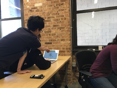
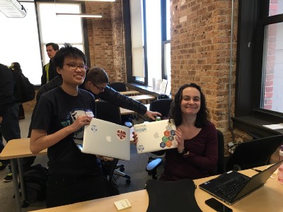
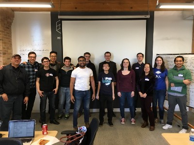 From L to R: Lilian and Nate working on the visualization; Lilian and Stephanie with their matching Sparkle stickers; and the Chicago gang that stuck it out til the end of two rigorous days of hacking!
At the end of our time together on Saturday, we recorded our progress for the rest of the teams to watch during the final showcase. You can see our video here:
In the last week, we’ve added two different Shiny apps, built using R Studio and the data.world SDK, to our list of accomplishments.
The first shows donations to aldermen by year. Lining them all up in a graph starts to show the magnitude of contributions to one aldermen over another. The second, inspired by the Louisville hackathon team’s voting record visualization, makes it easy to search for a topic and see each alderman’s vote on the related legislation (like, say, Chicago’s 2016 Olympic bid):
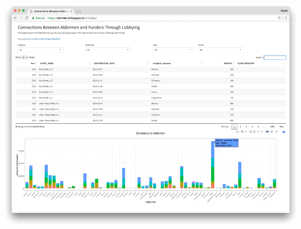
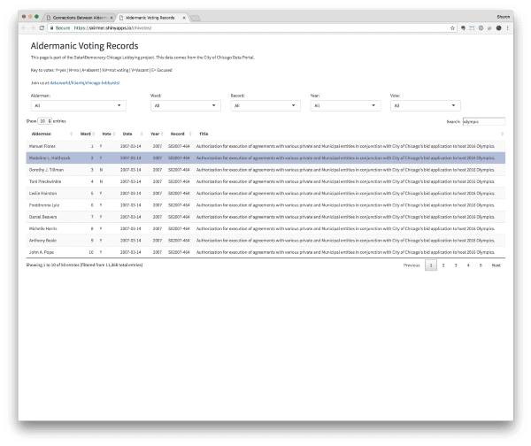 Check out the interactive versions: Connections between aldermen and funders through lobbying → and Aldermanic voting records→
These dashboards were inspired by interesting tidbits we uncovered through some exploratory visualizations shared over Slack:
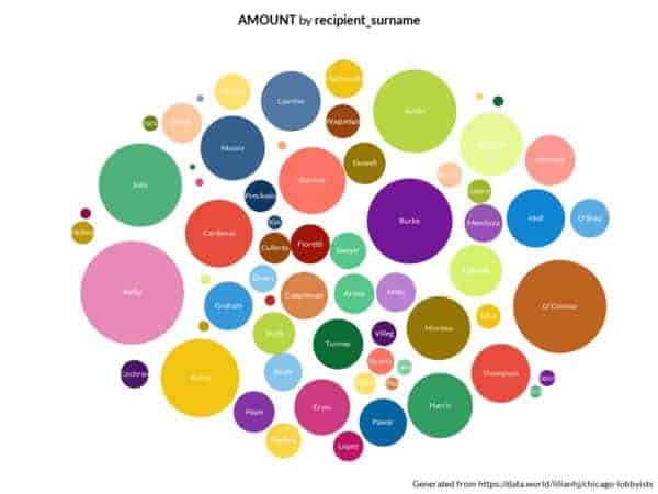
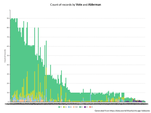 Check out the queries that generated these charts: contribution amounts by alderman and count of votes by alderman.
…and we’re continuing to investigate the data, add new sources, and discuss our findings both alongside the data and in Slack:
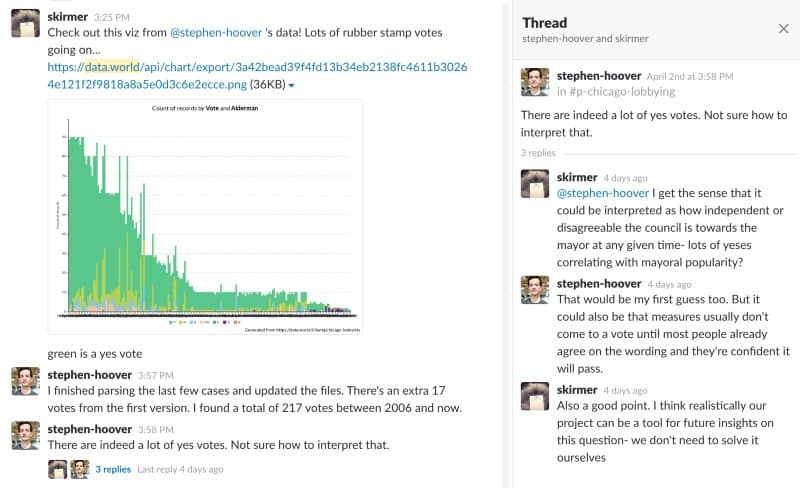 Ain’t no party like a D4D party, ‘cause a D4D party don’t stop 🎉
After most hackathons, it’s rare to keep in touch with the people — or data — you met over the weekend. But, since the D4D community started remotely (sharing everything online over Slack, Github, and data.world), we’ve already picked up where we left off!
Part of the magic of Data for Democracy is that “what’s next” is really up to each participant. Anyone can join (or create!) a new project and we’ve got plenty to choose from. So, join us on the Data for Democracy Slack team. We’ll be waiting for you in the #chicago-lobbying channel.
This article was written in collaboration with Lilian Huang and Stephanie Kirmer, and wouldn’t be possible without the hard work of Nate Wroblewski, Stephen Hoover, and all the other D4D Chicago hackathon participants!

 Our final visualization. Read on to see how we made it!
Those are the charges filed against Willie Cochran, a Chicago alderman accused of stealing “at least $30,000 from a charitable fund for poor constituents.” Cochran is the latest in a long line of Chicago officials indicted for corruption charges—over 1,000 since 1973.
Pretty stiff competition to get into the Chicago Hall of Shame.
So, how does an interested citizen stay informed about their local representatives? It seems impossible to keep track of legitimate political contributions, let alone the shady ones.
But, what if you could trace the money, based on publicly available data?
For the uninitiated, Data for Democracy is a group of 1,300 self-organized volunteers who work with data in order to improve the global community. D4D uses data.world, the social network for data people, to discover and explore data while collaborating on data projects.
Last weekend, hundreds of volunteers met up in major cities across the country (and remotely) to participate in the first D4D hackathon. We worked on dozens of civic projects, leveled up our data skills, and ate our weight in pizza (or, at least we did in Chicago).
“We could link alder-people by caucus or other ties, see their connections on the graph through politics and through lobbyist connections…maybe something in Shiny app form that people can play with… a network igraph would be pretty rad,” she mused on the #city-chicago Slack channel.
We considered the possibilities – what if we could link individual contributions to an alderman’s voting records? Could we track which special interests were influencing votes, understand what, when, and how much lobbyists were paying caucuses, and find a way to to put it all out in the open? That would be pretty rad.
So, we set out to answer this question:
We started with the City of Chicago’s open data portal. A quick search yielded a number of relevant datasets, including a list of all registered lobbyists since 2012 and their political contributions. It (almost) sounded like the work was already done!
But, as we explored the data, it wasn’t all sunshine and rainbows. Client industries were classified haphazardly, column definitions weren’t always clear, and tracing lobbyists to legislators would require joining multiple files. That meant we’d have to download each dataset (breaking the provenance chain), and create new files from them. We wouldn’t be able to share our findings or process alongside the data, making it more difficult for others to benefit from our analysis.
That’s where data.world came in. While preparing for the hackathon, we imported key datasets from the City of Chicago portal and other sources. We gathered data about Chicago lobbyists as well as a master dataset with links for each of the Chicago hackathon projects. This gave participants a single destination for all the relevant sources:

 A one-stop-shop for Chicago data on data.world
On Friday night, we all met in person for the first time. After weeks of chatting over Slack about potential data projects, scrutinizing our hackathon playlist, and debating who makes the best pizza in Chicago, we were finally ready to hack all the things!
Each lead pitched their idea to the group, and our 35 local participants broke out into three projects:
Chicago EPA started investigating Chicago’s water quality in light of funding cuts to programs that clean up the Great Lakes.
Bolsa Familia got to work analyzing the Brazilian social welfare program and its relationship to the 2014 election of Dilma Rousseff.
And of course, our project, Chicago lobbying, set out to connect the dots between special interests, lobbyists, and Chicago aldermen.
Once we split into groups, Team ChiLo got down to business. We white-boarded out the problem and broke it down into tasks. We dug into the data on data.world and researched visualizations similar to what we envisioned for our end result.

 Team ChiLo in action at the Metis Data Science Bootcamp space!
With only 10 hours together in person, our task list felt daunting. For the weekend, we decided to limit our scope to Chicago’s 50 aldermen instead of all elected officials.
We got to work cleaning and joining datasets in the data.world query tool (with the help of this handy tutorial), classifying the funding sources by industry, and joining alderman voting records with legislation details. We wrangled the data with a lot of R, some Python, and even good old-fashioned Excel. People of all skill levels contributed, using their tool of choice.
Of course, there were ups and downs. Early on, we were excited to find unique IDs for lobbyists…that turned out to not be unique…that after more investigation turned out to actually be unique. (Maybe? Jury’s still out.) We had to make a last-minute decision to constrain the time period to fewer years than we had hoped to analyze. But we persevered, and by half-way through the first night, we had enough data cleaned and transformed to spin off a dedicated Chicago lobbyists dataset:
 Check out the Chicago lobbyists dataset →
We added file descriptions and column definitions so others could understand the variables:
 data.world automatically aggregated descriptions from every file in the dataset, along with each column type.
Using the built-in query editor, we joined three files to combine data about aldermen, lobbyists, and clients into a single table:
 Dig into this query for yourself →
We exported that query and added it to the dataset as a new CSV. Opening the file full-screen, we got a good look at the data alongside the column metadata and visualized the data by selecting different columns to chart. Apparently, the most contributions come from the hospitality industry — over twice the amount of the next-highest sector (technology). Who knew!

 Explore this file →
By the next morning, we were ready to start on our showcase visualization. We settled on a network graph with a node for each funding source (orange), lobbyist (light blue), and alderman (dark blue). You can filter by alderman and see contribution amounts by hovering over each connection.
 A picture’s worth a thousand words, but an animation’s worth a million. Check out the interactive version →
By the end of the hackathon, we had racked up two new datasets, a bunch of R scripts, some new SQL knowledge (well, for a lot of us!), and a kick-ass D3 visualization. Really, something for everyone.
Plus we met some fellow data nerds, which was (at least!) half the fun 🤓.


 From L to R: Lilian and Nate working on the visualization; Lilian and Stephanie with their matching Sparkle stickers; and the Chicago gang that stuck it out til the end of two rigorous days of hacking!
At the end of our time together on Saturday, we recorded our progress for the rest of the teams to watch during the final showcase. You can see our video here:
In the last week, we’ve added two different Shiny apps, built using R Studio and the data.world SDK, to our list of accomplishments.
The first shows donations to aldermen by year. Lining them all up in a graph starts to show the magnitude of contributions to one aldermen over another. The second, inspired by the Louisville hackathon team’s voting record visualization, makes it easy to search for a topic and see each alderman’s vote on the related legislation (like, say, Chicago’s 2016 Olympic bid):

 Check out the interactive versions: Connections between aldermen and funders through lobbying → and Aldermanic voting records→
These dashboards were inspired by interesting tidbits we uncovered through some exploratory visualizations shared over Slack:

 Check out the queries that generated these charts: contribution amounts by alderman and count of votes by alderman.
…and we’re continuing to investigate the data, add new sources, and discuss our findings both alongside the data and in Slack:
 Ain’t no party like a D4D party, ‘cause a D4D party don’t stop 🎉
After most hackathons, it’s rare to keep in touch with the people — or data — you met over the weekend. But, since the D4D community started remotely (sharing everything online over Slack, Github, and data.world), we’ve already picked up where we left off!
Part of the magic of Data for Democracy is that “what’s next” is really up to each participant. Anyone can join (or create!) a new project and we’ve got plenty to choose from. So, join us on the Data for Democracy Slack team. We’ll be waiting for you in the #chicago-lobbying channel.
This article was written in collaboration with Lilian Huang and Stephanie Kirmer, and wouldn’t be possible without the hard work of Nate Wroblewski, Stephen Hoover, and all the other D4D Chicago hackathon participants!