

Mar 15, 2017
data.world Team

OK… I’ll say it. Data discovery is broken.
At data.world, we focus deeply on first-mile data problems like discovery, exploration, collaboration, and joining.
With well over 18 million open datasets out there today, finding the perfect data for your project or analysis can be quite a challenge. I like to think of data discovery as a meta-problem because to truly understand it, you have to dive into a cluster of sub-problems. Let’s take a look at how I might try to find some interesting data to work with:
Since I’m a data savvy guy, I’ll look for an open data portal that serves my needs. I can consult this handy list of over 2700 open data portals across the world to find something useful. Looking through it for something related to water, I don’t get many results as it’s mostly organized by locality. Next I’ll try Google:

Hmm, this might take a while! The good news here is that the first set of results seem very relevant, but I soon get mired in a deep hierarchy of government website silos where I’m greeted with pages that look like this:

Don’t get me wrong… resources such as these are incredibly valuable and I hope they don’t ever go away. Because if I’ve dedicated my life to the study of water quality, this is probably exactly where I need to start. But I’m a data scientist (OK, no I’m not, but let’s pretend), not a subject matter expert.
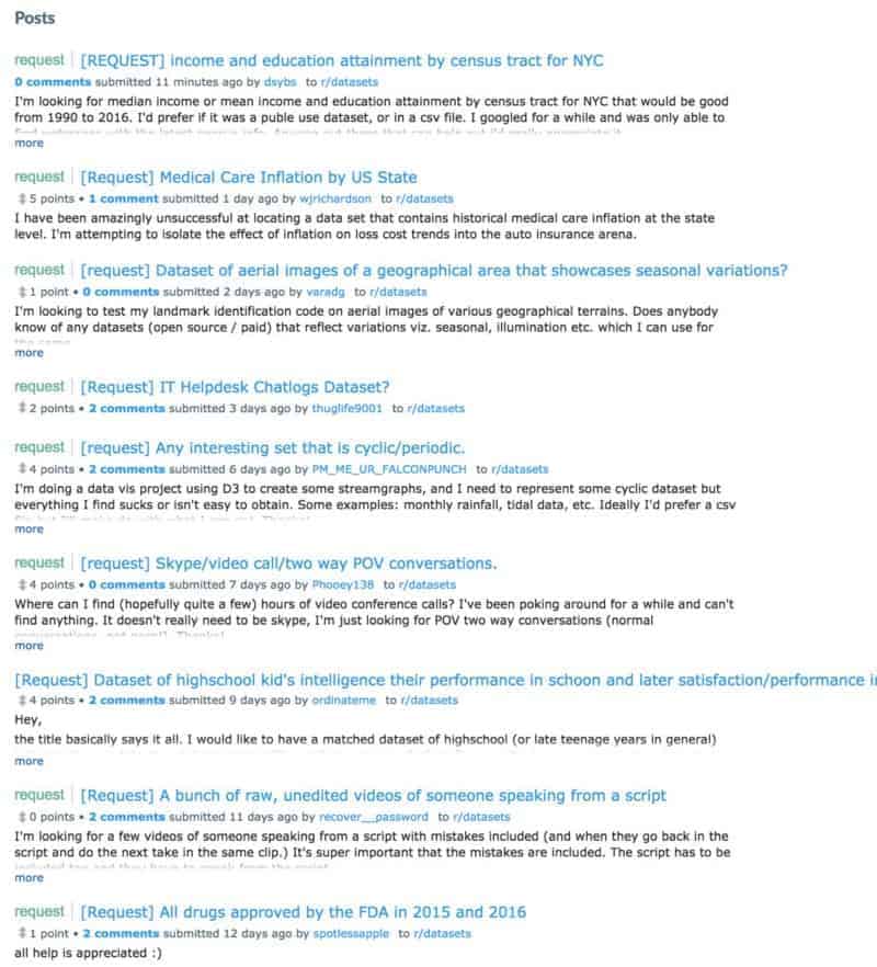
Next I’ll try the wonderful subreddit /r/datasets. With 24,000 readers, I should find what I’m looking for. What I find instead are some really fascinating datasets on a variety of topics and thousands of people like me searching for datasets with mixed success.
In 2009, the federal government made a historic push into the open data world with the launch of data.gov. I want to pause for a second and reflect on what a big deal this was. The fact that the US government made such a large scale, public commitment to open data is quite remarkable. There are internal mandates within the government about data publishing frequency (the stick vs. carrot approach, but that’s a subject for a future post), and aggregation. (side note: you may be familiar with the data rescue movement — I think the fears of government data going away are a bit over blown, but that’s a subject for a future future blog post). We’ve spoken with the data.gov team many times and have been incredibly impressed their incredibly deep expertise and conviction to the open data cause.
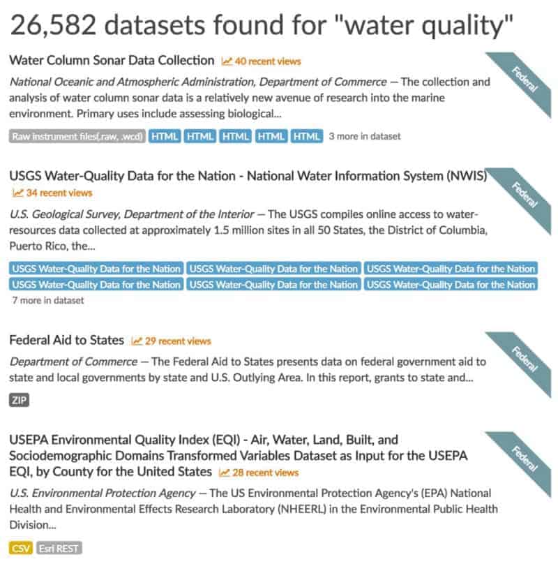
Back to the task at hand. I’ll do a search on data.gov for “water quality”. I get a slightly more manageable but still large set of over 26,000 results.
 whoa…
whoa…Just for fun, here’s an example of a “dataset” so specific yet so deep that it has 11 separate sub-datasources.
But it gets a little worse: See those little “html” tags? That is data.gov speak for a link to an external website. Typically those websites are other open data portals (local, state, federal agency, academic) or subject matter based sites such as the mega form displayed above. Painfully, according to the search page sidebar, 23,273 of those results are listed as available in “html” format. Now I see why Google had 571 million results.
 what exactly is an “Expendable Bathythermograph”?
OK, I’ll bite the bullet and dig into these datasets. Here’s where things start to get REALLY crazy. data.gov provides some amazing advanced search capabilities, but it is still very difficult to cut through the vastness. Here’s what the file format filter looks like on that search page. Apologies in advance for the extremely tall image, but there are 48 different file formats available for filtering. 48! Forty Eight! XLVIII! I spent 10 minutes trying to screenshot the entire filter group and I finally gave up. My only hope is that I can use all of this vertical space to explain this a bit more.
In this list there are common general purpose data formats such as JSON, CSV, and XML. But only 152 CSVs out of 26,000 results? And why are PDFs and image formats such as TIFF and JPG so much more common? Well it turns out that many “datasets” are PDFs with text tables inside them. Or even worse, PICTURES of text tables.
A quick anecdote here — I had the honor of being invited to a federal data cabinet meeting last year. You can think of the data cabinet as a meetup for the people responsible for data at all federal agencies. The meeting started with some “lightning talks” by select members of the data cabinet. The first one really stuck with me because the speaker asked for a show of hands: “how many of you have been publicly called out on twitter for releasing data tables locked inside PDFs?” About 3/4 the room raised their hands while exchanging sheepish glances. The speaker went on to talk about shifting the focus of open data toward usability instead of volume (which just so happens to be more or less tattooed on the forehead of everyone here at data.world).
How am I doing? Still reading that list of formats? Down here near the bottom you’ll see some things that look like they must be data entry mistakes. The pitfalls of being so specific when dealing with dirty metadata is that something like “Informal metadata text” gets classified as a file format.
I’ll dig into something promising, a dataset called US 15 minute precipitation data with 15 sub datasources. While most of these sub-sources are links to other sites, there is a sample CSV available for direct download. Here’s what it looks like:

I’m left wondering what things like QPCP mean, and how exactly the stations are formatted. Well, there’s good news and bad. The good news is that after a few more minutes of digging through the 14 other sub-resources (some of which are duplicated, while some link to missing pages), I find a 5 page PDF explaining the format of these files.
QPCP: X: Used for data prior to 1996 as part of a 1997 data rehabilitation effort. Indicates value failed an extreme value test; data are to be used with caution. Extreme tests were: 1) if the value was not an accumulated precipitation total, the value failed the one hour statewide 100 year return period precipitation and 2) if the value was an accumulated precipitation total, the value failed the 24 hour statewide extreme precipitation total.
The other options for that field are Z, R, Q, q, and A (yes Q/q mean different things!). The next logical thing for me to do is to ask about 10 more follow up questions about this dataset, but this is where I hit a total dead end.
Now remember that data cabinet meeting? Part of making this data more usable involves making it easy to contextualize it and easily understand it. Traditionally that means documentation, column schemas, but what’s really missing is the social element. Data does not grow on trees (though maybe some computational arborists would disagree). At every step of the way, people were involved in the planning, design, collection, review, publication, refreshing, and reporting of this data. Where are those people now where I need them most?
It’s not just the data creators that I’d like to find, but what about other consumers? I imagine that a continuously updated dataset called “US 15 minute precipitation” is incredibly popular and highly used in derivative works. But how would I find those people? Someone somewhere has surely butted their head up against QPCP before. What cool and useful things have been built using this dataset?
It turns out that the federal agency folks deeply understand this problem, but are faced with a few obstacles. The most important of which is that a .gov website is not the appropriate place to host a thriving community. There are inherent challenges and risks in online communities, just poke around the comments section on YouTube for a while. While there have been a few toe-dips in the water from federal and city sites, the folks I’ve talked to would much rather allow those discussions to happen elsewhere.
One such example is this:

Each of those buttons leads to form to fill out with your name, email, and text description. It’s a start, but decidedly one-way solution.
OK, here’s the part where I tell you that data.world solves all of these problems — case closed. Well, give this a read if you want to learn more about the vision of how data discovery should work. In the meantime, what I’d like to close with is how we’re tackling these huge problems. This blog post initially started out as a humble feature announcement, but having spent 5 days expanding my mind at SXSW Interactive, I felt that telling a deeper story was appropriate.
We feel so strongly about data discovery that we have a product pod named the “disco pod” (short for discovery, collaboration, and search). I’d be lying if I said I don’t get called “Disco Joe” from time to time. We have huge plans for data discovery and search, and we’re starting to roll those features out over the next few weeks and months.
Search is front and center to the data.world experience, as evidenced by the fact that the search box is the first thing you see on the page:

Diving into search we’ve recently launched a few new things:
1: Search within datasets by column name. A search for column:zip will match datasets that contain files that contain columns names containing the term “zip”. This can be incredibly helpful to find datasets that can be joined or merged together
2: Refine searches by user or organization. Adding AND org:cityofaustin to a search will restrict results to datasets coming from the City of Austin. (Google Fiber and restaurant inspections — interesting mashup in the making?)
3: Search for explicit time windows. Using the search operators created or updated restricts searches to datasets or users with activity within those windows. For example created:>=2016–11–01
4: Restrict searches to datasets or people and organizations. Remember, people are the most important part of a dataset. Their knowledge, experience, and even biases are a critical part of the whole story.
5: Refine searches by tags: We encourage everyone who uploads a dataset to add tags to help categorize or classify what the dataset is about. For any given search, a list of most common tags within those results will help with further refinement.

When you select multiple tags we treat this as an OR search to help expand your search space and expose you to options you may not normally have considered.
Our documentation site has more information about advanced search on data.world.
I normally do not like to detail the specifics of what we’re working on, or tests we’re running, but as our team continues to tackle these discovery problems we’ll be rolling out the ability to filter searches by file name, file type and license attributes, geographic area and time bounds. We’ve learned a lot from the examples I showed above about how these types of filtering can quickly become overwhelming, but we’re moving towards a world where I can visit data.world and easily find most popular tabular data about water quality with zip code level precision containing data points in the southwestern United States between 1995 and October of 2003.
One of the most common questions we get around search is “when can I search within the data?” This is definitely on our radar, but complications abound. There are platforms today which breathlessly claim to allow searching within datasets, but in practice it proves to be a discoverability and usability nightmare. Imagine if I search for “Oak” in an attempt to find data about Oak trees. I’ll have a tough time sorting through the millions of results that simply addresses on Oak street. There isn’t a good way to understand the intent of my query to know if the results should bias trees or addresses.
We’ve built data.world from the ground up on top of semantic web tech to provide a foundation to solve problems exactly like this. Searching within data only makes sense if it can be done with semantic meaning instead of just keywords. This is a concept still in it’s relative infancy, and is being tackled by some of the largest tech companies in the world. Whenever you see a summary box result on a Google search page, it’s because that search query was detailed enough for Google’s algorithms to strongly infer intent from the query which unlocks the ability to return results from their Knowledge Graph in addition to the corpus of crawled pages.
NLP + semantics is the cutting edge way to address this need (I’m talking to you Google Home and Alexa). Since every single dataset in data.world is already represented as a semantic graph, we have a great head start to build towards this jetpack future.
I’d love to hear your thoughts about data discovery — what have you found that works and what doesn’t? And if you haven’t already signed up for data.world, it’s free and you definitely should.

OK… I’ll say it. Data discovery is broken.
At data.world, we focus deeply on first-mile data problems like discovery, exploration, collaboration, and joining.
With well over 18 million open datasets out there today, finding the perfect data for your project or analysis can be quite a challenge. I like to think of data discovery as a meta-problem because to truly understand it, you have to dive into a cluster of sub-problems. Let’s take a look at how I might try to find some interesting data to work with:
Since I’m a data savvy guy, I’ll look for an open data portal that serves my needs. I can consult this handy list of over 2700 open data portals across the world to find something useful. Looking through it for something related to water, I don’t get many results as it’s mostly organized by locality. Next I’ll try Google:

Hmm, this might take a while! The good news here is that the first set of results seem very relevant, but I soon get mired in a deep hierarchy of government website silos where I’m greeted with pages that look like this:

Don’t get me wrong… resources such as these are incredibly valuable and I hope they don’t ever go away. Because if I’ve dedicated my life to the study of water quality, this is probably exactly where I need to start. But I’m a data scientist (OK, no I’m not, but let’s pretend), not a subject matter expert.
Next I’ll try the wonderful subreddit /r/datasets. With 24,000 readers, I should find what I’m looking for. What I find instead are some really fascinating datasets on a variety of topics and thousands of people like me searching for datasets with mixed success.

In 2009, the federal government made a historic push into the open data world with the launch of data.gov. I want to pause for a second and reflect on what a big deal this was. The fact that the US government made such a large scale, public commitment to open data is quite remarkable. There are internal mandates within the government about data publishing frequency (the stick vs. carrot approach, but that’s a subject for a future post), and aggregation. (side note: you may be familiar with the data rescue movement — I think the fears of government data going away are a bit over blown, but that’s a subject for a future future blog post). We’ve spoken with the data.gov team many times and have been incredibly impressed their incredibly deep expertise and conviction to the open data cause.
Back to the task at hand. I’ll do a search on data.gov for “water quality”. I get a slightly more manageable but still large set of over 26,000 results.

 whoa…
whoa…Just for fun, here’s an example of a “dataset” so specific yet so deep that it has 11 separate sub-datasources.
But it gets a little worse: See those little “html” tags? That is data.gov speak for a link to an external website. Typically those websites are other open data portals (local, state, federal agency, academic) or subject matter based sites such as the mega form displayed above. Painfully, according to the search page sidebar, 23,273 of those results are listed as available in “html” format. Now I see why Google had 571 million results.
 what exactly is an “Expendable Bathythermograph”?
OK, I’ll bite the bullet and dig into these datasets. Here’s where things start to get REALLY crazy. data.gov provides some amazing advanced search capabilities, but it is still very difficult to cut through the vastness. Here’s what the file format filter looks like on that search page. Apologies in advance for the extremely tall image, but there are 48 different file formats available for filtering. 48! Forty Eight! XLVIII! I spent 10 minutes trying to screenshot the entire filter group and I finally gave up. My only hope is that I can use all of this vertical space to explain this a bit more.
In this list there are common general purpose data formats such as JSON, CSV, and XML. But only 152 CSVs out of 26,000 results? And why are PDFs and image formats such as TIFF and JPG so much more common? Well it turns out that many “datasets” are PDFs with text tables inside them. Or even worse, PICTURES of text tables.
A quick anecdote here — I had the honor of being invited to a federal data cabinet meeting last year. You can think of the data cabinet as a meetup for the people responsible for data at all federal agencies. The meeting started with some “lightning talks” by select members of the data cabinet. The first one really stuck with me because the speaker asked for a show of hands: “how many of you have been publicly called out on twitter for releasing data tables locked inside PDFs?” About 3/4 the room raised their hands while exchanging sheepish glances. The speaker went on to talk about shifting the focus of open data toward usability instead of volume (which just so happens to be more or less tattooed on the forehead of everyone here at data.world).
How am I doing? Still reading that list of formats? Down here near the bottom you’ll see some things that look like they must be data entry mistakes. The pitfalls of being so specific when dealing with dirty metadata is that something like “Informal metadata text” gets classified as a file format.
I’ll dig into something promising, a dataset called US 15 minute precipitation data with 15 sub datasources. While most of these sub-sources are links to other sites, there is a sample CSV available for direct download. Here’s what it looks like:

I’m left wondering what things like QPCP mean, and how exactly the stations are formatted. Well, there’s good news and bad. The good news is that after a few more minutes of digging through the 14 other sub-resources (some of which are duplicated, while some link to missing pages), I find a 5 page PDF explaining the format of these files.
QPCP: X: Used for data prior to 1996 as part of a 1997 data rehabilitation effort. Indicates value failed an extreme value test; data are to be used with caution. Extreme tests were: 1) if the value was not an accumulated precipitation total, the value failed the one hour statewide 100 year return period precipitation and 2) if the value was an accumulated precipitation total, the value failed the 24 hour statewide extreme precipitation total.
The other options for that field are Z, R, Q, q, and A (yes Q/q mean different things!). The next logical thing for me to do is to ask about 10 more follow up questions about this dataset, but this is where I hit a total dead end.
Now remember that data cabinet meeting? Part of making this data more usable involves making it easy to contextualize it and easily understand it. Traditionally that means documentation, column schemas, but what’s really missing is the social element. Data does not grow on trees (though maybe some computational arborists would disagree). At every step of the way, people were involved in the planning, design, collection, review, publication, refreshing, and reporting of this data. Where are those people now where I need them most?
It’s not just the data creators that I’d like to find, but what about other consumers? I imagine that a continuously updated dataset called “US 15 minute precipitation” is incredibly popular and highly used in derivative works. But how would I find those people? Someone somewhere has surely butted their head up against QPCP before. What cool and useful things have been built using this dataset?
It turns out that the federal agency folks deeply understand this problem, but are faced with a few obstacles. The most important of which is that a .gov website is not the appropriate place to host a thriving community. There are inherent challenges and risks in online communities, just poke around the comments section on YouTube for a while. While there have been a few toe-dips in the water from federal and city sites, the folks I’ve talked to would much rather allow those discussions to happen elsewhere.
One such example is this:

Each of those buttons leads to form to fill out with your name, email, and text description. It’s a start, but decidedly one-way solution.
OK, here’s the part where I tell you that data.world solves all of these problems — case closed. Well, give this a read if you want to learn more about the vision of how data discovery should work. In the meantime, what I’d like to close with is how we’re tackling these huge problems. This blog post initially started out as a humble feature announcement, but having spent 5 days expanding my mind at SXSW Interactive, I felt that telling a deeper story was appropriate.
We feel so strongly about data discovery that we have a product pod named the “disco pod” (short for discovery, collaboration, and search). I’d be lying if I said I don’t get called “Disco Joe” from time to time. We have huge plans for data discovery and search, and we’re starting to roll those features out over the next few weeks and months.
Search is front and center to the data.world experience, as evidenced by the fact that the search box is the first thing you see on the page:

Diving into search we’ve recently launched a few new things:
1: Search within datasets by column name. A search for column:zip will match datasets that contain files that contain columns names containing the term “zip”. This can be incredibly helpful to find datasets that can be joined or merged together
2: Refine searches by user or organization. Adding AND org:cityofaustin to a search will restrict results to datasets coming from the City of Austin. (Google Fiber and restaurant inspections — interesting mashup in the making?)
3: Search for explicit time windows. Using the search operators created or updated restricts searches to datasets or users with activity within those windows. For example created:>=2016–11–01
4: Restrict searches to datasets or people and organizations. Remember, people are the most important part of a dataset. Their knowledge, experience, and even biases are a critical part of the whole story.
5: Refine searches by tags: We encourage everyone who uploads a dataset to add tags to help categorize or classify what the dataset is about. For any given search, a list of most common tags within those results will help with further refinement.

When you select multiple tags we treat this as an OR search to help expand your search space and expose you to options you may not normally have considered.
Our documentation site has more information about advanced search on data.world.
I normally do not like to detail the specifics of what we’re working on, or tests we’re running, but as our team continues to tackle these discovery problems we’ll be rolling out the ability to filter searches by file name, file type and license attributes, geographic area and time bounds. We’ve learned a lot from the examples I showed above about how these types of filtering can quickly become overwhelming, but we’re moving towards a world where I can visit data.world and easily find most popular tabular data about water quality with zip code level precision containing data points in the southwestern United States between 1995 and October of 2003.
One of the most common questions we get around search is “when can I search within the data?” This is definitely on our radar, but complications abound. There are platforms today which breathlessly claim to allow searching within datasets, but in practice it proves to be a discoverability and usability nightmare. Imagine if I search for “Oak” in an attempt to find data about Oak trees. I’ll have a tough time sorting through the millions of results that simply addresses on Oak street. There isn’t a good way to understand the intent of my query to know if the results should bias trees or addresses.
We’ve built data.world from the ground up on top of semantic web tech to provide a foundation to solve problems exactly like this. Searching within data only makes sense if it can be done with semantic meaning instead of just keywords. This is a concept still in it’s relative infancy, and is being tackled by some of the largest tech companies in the world. Whenever you see a summary box result on a Google search page, it’s because that search query was detailed enough for Google’s algorithms to strongly infer intent from the query which unlocks the ability to return results from their Knowledge Graph in addition to the corpus of crawled pages.
NLP + semantics is the cutting edge way to address this need (I’m talking to you Google Home and Alexa). Since every single dataset in data.world is already represented as a semantic graph, we have a great head start to build towards this jetpack future.
I’d love to hear your thoughts about data discovery — what have you found that works and what doesn’t? And if you haven’t already signed up for data.world, it’s free and you definitely should.