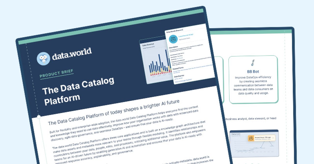
Need to know what a Nashville-based truck driver makes in a quarter? Mark Bergenholtz built an app for that.

The next time you hear a politician boast about creating jobs, fire up Mark Bergenholtz’s U.S. County Data Center and see how the claim looks in the cold light of data.

The app and its underlying Data Project “provide reformatted and clean versions of U.S. county level data sets, with simple filtering options and an intuitive geographic display, using the R shiny dashboard.”

We reached out to Mark to learn more about his motivation and vision for the app.


Origin story

During my college education I was always very enthusiastic about experimenting with economic data and trying to tease out relationships between variables.

I thought it would be nice to try to make a website were people who are not as familiar with government organizations or economic data in general to quickly access and understand the data they are looking at.

Aside from that I consider myself a constant student and thought launching a R Shiny application would be a great way to develop my skills as a data scientist. As strange as it might sound, a lot of the work I put into this project was really just for fun.

“Aha!” moment

I had been determined to make a shiny web application for a while, but still was having a tough time nailing down a final project outline. While I was working on a project at UCLA I needed a large amount of data from the QCEW and I found myself getting frustrated with how difficult it was to access the data I needed.

It was a shame, I thought, that any analysis or investigation based on this dataset must first begin with hours of trudging through websites and individual CSV files.

After my project was complete, I noticed that without too much work I could tweak my code to automate the data collection process, and allow for user-selected options, such as a particular range of years or employment in a specific industry or sector. Thus, the idea was born.

Dream use case

I would love to see the geographic data maps used to inform and fact-check political debates on economic issues.

For example, if a politician claims to have brought jobs back to working class Americans, trends in blue collar employment could be quickly evaluated in their district and comparable regions.

A more likely use for this project is that it could be used by college Econ majors and other aspiring economists to quickly access public economic data about any issue that piques their interest, especially if they are unfamiliar with the complex layouts of some government websites.

How you can help

Quality checks! Please let me know if you see any issues. Due to the huge amount of data I’ve incorporated so far it is very difficult to make sure things are formatting and displaying correctly. I am aware of a few issues with some of the more obscure population subsets included but have been busy with other projects and trying to find a way to increase the launch speed of this application.

Also, although I’m primarily focused on economic data,

I am open to include pretty much any datasets that…

1. Are available at the County level.

2. Are available at an annual frequency (or Higher).

3. Are interesting–especially to researchers!

U.S. County Data Center

Data work is much easier when everyone can contribute to it. Learn how to use data.world to collaborate with your professional teammates on your data projects here.